A Beginner Guide to Simple Shading on Your Fantasy Maps
Adding shading to your fantasy map brings a whole new level of depth and texture that can help your readers or players visualize the landscape you've created. But if you don’t consider yourself an “artist”, then the idea of shading might feel very overwhelming. Between what colors to use, light direction, and form, it can be difficult to know where to begin.
Don't worry! In this beginner friendly tutorial, I’ll walk you through an extremely simple method for shading your map that I am confident anyone can do; regardless of your perceived artistic abilities. So let’s start mapping!
Choose a Light Source
The first thing to do is determine where your light source will be. You can put it wherever you want, but the upper-left is a classic position. Because in our culture we read from left to right, visually it tends to feel more comfortable to read a painting following the same direction.
Add the Base Shadows
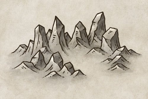
Create a new layer below your line art and set the blend mode to “Multiply”. Then use a brown (#A98871) to block in the main shadows on the right side of the mountains where the light would be hidden.
It is helpful to use a low opacity, pressure sensitive brush which will allow you to build up colors gradually. This will give you a process similar to a more traditional tool like watercolor, especially if you use a brush like I am that has some texture baked into it.
You can see an example of the brush I’m using below.
The Fantasy Map Builder
$34
Now compatible with Procreate, Photoshop, Affinity Photo, & Clip Studio Paint!
Easily create hand-drawn fantasy maps for your upcoming fantasy novel or next role playing campaign without learning how to draw! Includes over 300 unique features to bring your world to life.
Add Drop Shadows to the Trees
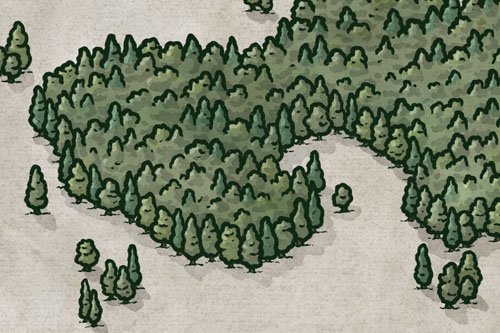
On the same layer, you can now add some simple drop shadows on the ground next to your trees. Just keep your light source in mind to inform the direction of the shadows, but keep it simple. This just helps the trees feel part of the landscape and not merely sitting on top of it.
Add Contrast
Everything is already looking pretty good but you can take things up a notch by making a second pass at the shadows. If you are using your low opacity brush you can still work on the same layer and it will darken the color wherever you paint.
Deepen the shading near the peaks of the mountains, and following the ridgeline. You can also go down the sides of the mountains a bit and use your line art as a bit of a guide. Finally you can hit the right side of each tree with a bit more shading to give more dimension.
Paint the Finishing Highlights
Finally, create another layer below your line art and set the blend more to “Add” (Linear Dodge in PS). Use the same process that you did in the previous step, but this time paint the highlights on the left side of the mountains. You don’t even need to switch colors because the blend mode is doing all the magic!
Last but not least, add a simple highlight on the left side of each tree, particularly near the top.
The “Add” blend mode does tend to be a bit strong, so don’t be afraid to adjust the opacity slider a bit after the fact to dial it into something you like. I set mine to 90% in this example.
While there are certainly ways to make shading more complicated, this is a really easy method you can use to help your fantasy maps pop. Honestly, because the features on a typical map would be even smaller than our example here, most of the time you don’t need much more than this anyway. So don’t let yourself get overwhelmed by the process. If you can color in a kids coloring book then you can do this!
Happy Mapping!
- Josh


