How to Draw Kragspire Mountains
Embark on a journey through the untamed peaks of the Kragspire Mountains. In this tutorial, I’ll walk you through the technique I used to draw all of the brushes in The Kragspire Mountains Brush Pack. Whether you prefer to draw everything yourself, or you want to expand upon the mountains included in the pack, this tutorial will give you what you need to add these impassable rock formations to your fantasy maps. Mountains are not just obstacles; they are characters in your tale, whispering of dangers unknown.
Let’s Start Mapping!
Sketch the Main Mountain Peaks
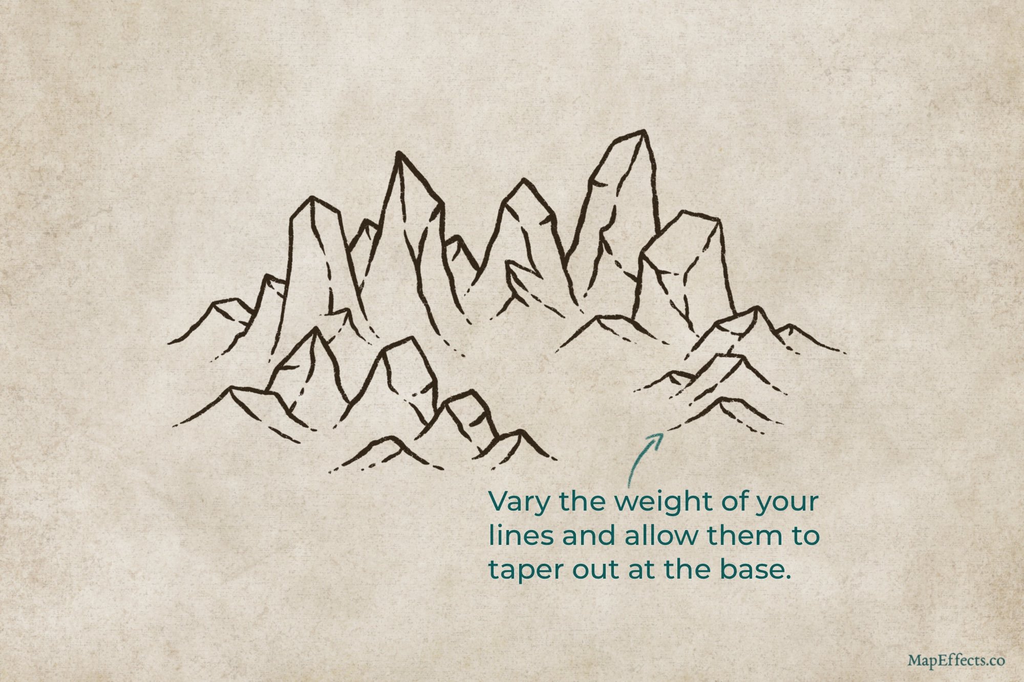
Begin by sketching the main mountains that will make up your range. Vary the height and the amount they overlap to lay out their basic shape. One of the keys to this style is to make sure the peaks have sharp, but triangular or squared-off tops. The other thing is to keep their fairly narrow and verticle. They can taper out a bit at the base, but don’t overdo it.
Sketch the Surrounding Foothills
Fill out around your main mountains with some smaller foothills. I usually like to have the tallest mountains near the center, with them gradually getting smaller as the range tapers into the landscape. Just make sure even the small hills have sharp angles on the tops and that they aren’t too rounded like they normally when be when you draw hills. We want that rocky look!
Add Dimension to the Mountains
It’s now time to give some dimension by adding some ridgelines. I find it helpful to think about Kragspire Mountains like abstract boxes as I add these lines. You can still add small cliffs at the base though, but try to still use sharper angles to fit the overall look. You’ll also notice that I almost always use broken lines for the ridgelines to help it feel more organic.
Ink the Main Line Art
Whether you are working with paper or digitally, the next step is to go over your sketch with an inking pen. I prefer brush pens if I’m working traditionally, or a pressure-sensitive brush if I’m on an Ipad. This allows you to easily vary the width of the lines, and have them taper out, particularly at the base.
Now let’s start adding some detail!
More Mapping Tutorials
Ink the Details & Give Texture
As you ink in some detail, you want to think about adding texture and putting emphasis on the contours of the mountains. You can do this either with broken verticle lines to flow down the side of the rock face. Or, one method I really like to use on mountains is to draw a series of small horizontal hatching lines that still follow the same verticle contour of the mountain.
Block in the Main Color
Create a new layer if you’re working digitally, and set the blend mode of the layer to Linear Burn. You can then use a low opacity brush like something for watercolor to block in the main color with a medium gray. Once I’ve done that, I like to take The Smudge Tool Included in the Free Apprentice Brush Pack to blend the color into the surrounding landscape.
Paint the Base Shadows
First thing you have to do is determine your light source and begin to imagine the mountains like 3D objects. Picture where the rock faces would be hidden from the light source and just block in some broad shadows. Once again, create a new layer, set the blend mode to Linear Burn, and wit a medium-grey you can paint in some shading.
It’s good to allow some hard and soft edges as well to have variety and contrast. You don’t want everything to look too smooth or it will tend to look “digital” and fake. Don’t be afraid of hard edges, but if you want to soften an edge just use that same textured brush as a smudge tool. The reason I like a brush like that for blending is it still has texture like a frayed brush baked into it so even the “smooth” blending looks more like a messy brush than a plastic gradient.
Darken the Shadows for Contrast
Alright, now it’s time to really start bringing these mountains to life. Create another layer, set it to Linear Burn, but this time switch to more of a blue-grey color. Because the paper texture is already somewhat warm, the cooler hue will create something called color contrast. When outdoors where everything is lit by the sun, you’ll notice the shadows are quite a bit cooler. The reason for this is they aren’t receiving direct influence from the sun, but are instead being lit by the ambient light of the blue sky.
Color Theory Tip!
While this is still more of a sepia-toned map, don’t be afraid to introduce subtle color theory like this to make your map more dynamic. What’s interesting is if you were to use the eyedropper tool on the shadows compared to the other side of the mountain, the shadows are still within the range of an orange hue. But, since they are less saturated, on the color wheel they are beginning to move toward blue even though they aren’t fully there. This makes them look cooler because the context of everything else around them is warmer and more saturated.
Paint the Base Highlights
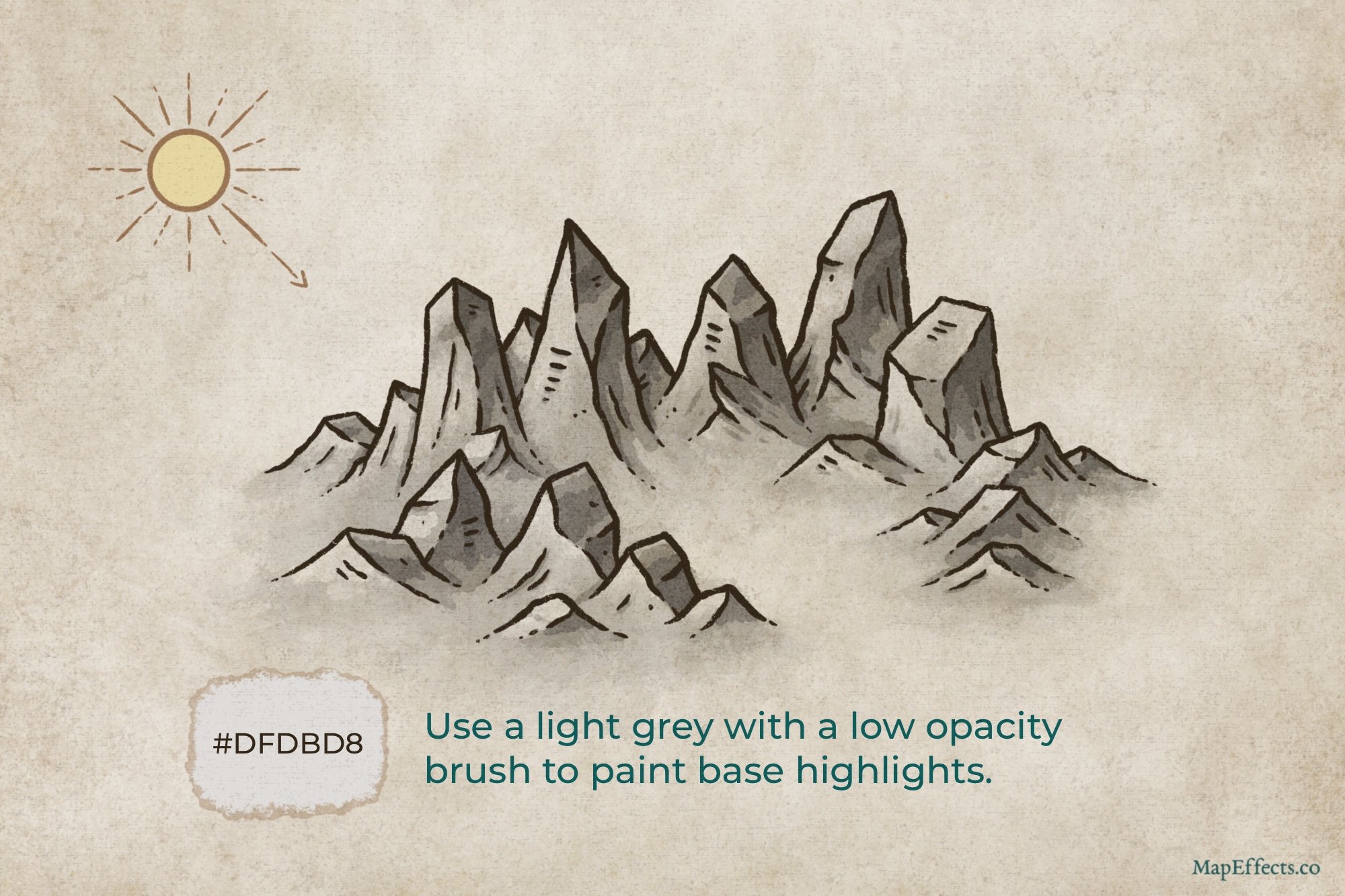
Create another layer, but this time set it to Add or Screen. I have found that what looks best will depend on the app your using, and each project. It’s easy enough to switch between them after the fact so just see which you prefer! Select a lighter grey, and with the same low-opacity brush, begin painting the broad highlights on the rock faces illuminated by your light source. Usually, you want brighter highlights near the tops to give contrast and make them look more rocky.
Add Sharper Highlights
Last of all, it’s time for some final highlights. Since you are using a low opacity brush, you can probably still paint on the same layer as the previous step. But, sometimes it’s nice to keep things separate so you can adjust the opacity slider after the fact if you need to. Just paint some shaper highlights near the peaks of the mountains to add the finishing pop of contrast.
I hope you found this helpful, and I look forward to seeing your maps!
Josh


