
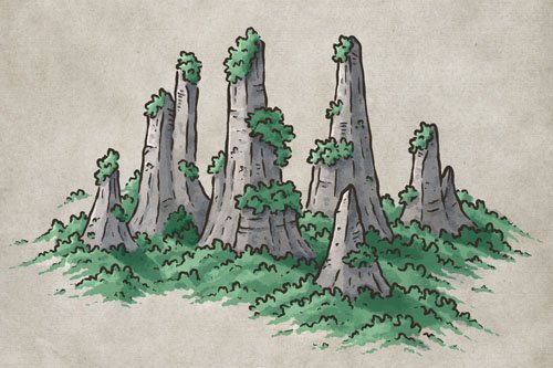
How to Draw Stone Pillars

If you enjoy finding inspiration for your stories from real-world locations, then look no further than the stone pillars of Wulingyuan, China. These impressive monoliths are one of the most iconic locations in the world; with their unusual shape, covered with trees that somehow manage to grow hundreds of feet in the air like a natural hanging garden. In fact, the movie Avatar pulled inspiration from this location when creating the world of Pandora! But the real question is, how do you draw something like that on your fantasy map? In this tutorial, I’ll break down the process so you can add these iconic features to the world you’re crafting.
All of the brushes I will be using for this tutorial are available in The Cartographer’s Liner Brush Field Kit for Procreate, Photoshop, & Clip Studio Paint
Wulingyuan, China

Tutorial Walkthrough

Sketch the Pillars
The first thing you’ll want to do is roughly sketch where you want the stone pillars to appear on your map. Use a pencil and sketch some simple pillar shapes that vary in size and overlap one another to convey a sense of depth. Be sure to include small peaks and cliff ledges on each pillar as this will be important for the next step.

Sketch Cliffs and Peaks
Now look for those ridges and peaks you added and draw a horizontal line to give the impression of a cliff, or a vertical line downward to indicate a secondary peak. The cliffs will help build up layers on your illustration as well as give you a place to add vegetation in an upcoming step.
For the base of the rock formations, you can use broken lines to taper them into the surrounding landscape. This will eventually get covered in trees, but it’s helpful to sketch the contours of the terrain for when you place the forest later.

Give the Pillars Form
You can now sketch the tops of the cliffs and add some broken verticle lines down each of the pillars. You’ll notice that these rock formations are a bit boxy in nature, so imagine you are drawing large rectangular boxes that are stacked together.

Scribble Some Vegetation
The last thing to sketch is the trees and vegetation that are growing on top of the cliffs and in the valleys between the pillars. For this tutorial we are going to use a bit more of an impressionist style of forests so that it blends better with the landscape. The trick is to use a loose, cloud-like stroke when drawing the tops of the trees.
Then, you can add vegetation near the base of the pillars and blend it in with the rest of the landscape. Be sure to check out my Video Tutorial on How to Draw Forests for a further breakdown of the process.
Now let’s start inking!
More Mapping Tutorials

Ink Over the Sketch
Create a new layer above your sketch and switch to a liner brush to ink in the final line work. My preference is to use something that is pressure sensitive so you can easily vary the width of the brush depending on how hard you press. If you are using traditional tools then I highly recommend a brush pen.
As you ink over your drawing, try to use a thicker stroke for the silhouette of the pillars to help them stand out from the background. Then you can use more broken lines for the forest, cliffs, and contours of the rock formations.
You can purchase the Bold Brush Pen I am using for all of the line art in the Liner Brush Field Kit through the Shop


Add Details & Texture
Now for the fun part of just adding a bit more detail and texture to everything. You can mix it up with some hatching down the sides of the cliffs, a bit of stippling, or a couple of squiggly lines to give the impression of vegetation. I find for this step it is better to work pretty loose and not overthink it. It’s just a bit of intentional scribbling to give some character!
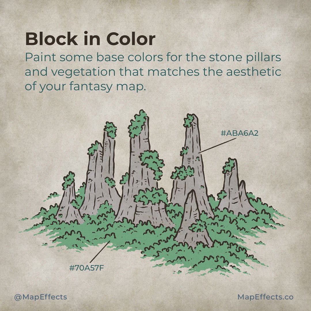
Block in Color
You can now create a new layer below your line work so you can block in some colors. For this example, I will be using relatively subdued colors to match the aged-paper background. The green for the forests (#70A57F) is a bit on the cooler side, while the stone (ABA6A2) is actually a very desaturated orange/brown. This gives the impression of it being much cooler in hue, without actually shifting fully into the blues. That will happen more in the following steps when it comes to shading.

Cartographer’s Liner Brush Field Kit
$29 | For Procreate, Photoshop, & Clip Studio Paint
The Cartographer’s Liner Brush Field Kit contains all the liner brushes you need to draw your own fantasy maps and bring a traditional, hand-made quality to your digital work!

Paint the Primary Shadow
Create another layer above your colors and set the blend mode to “Linear Burn”. Then pick a mid-tone blue (#91A0AD) and switch to a brush low-opacity brush so you can build up the shading gradually.
For this map, our light source is going to be in the upper-left corner. So, begin painting some flat shadows on the right side of the rock formations, as well as cast-shadows on the forest below where they would block the light. Your cast shadows do not need to be the exact shape of the pillars, but try to match up the angle of the shadow to stay consistent.
You can purchase the Heavy Marker Brush I am using for all of the shading in the Liner Brush Field Kit through the Shop

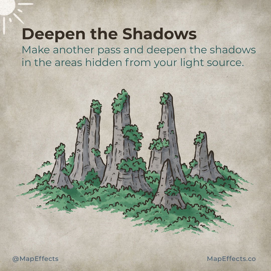
Deepen the Shadows
With your main shadows in place, you can make another pass to deepen the shading in the areas that would be most obscured from the light source. Add cast shadows on the right side of the vegetation, or along the detail lines to give the impression of cracks in the rock. You can also deepen the shading near the tops of the stone pillars as it would appear darker because it wouldn’t receive as much reflected light.
Be sure to check out the video tutorial I did as well on How to Draw Organic Forests on Your Fantasy Map for more tips on how to shade the trees around the base of the pillars.

Add a Pop of Highlights
Create a new layer and set the blend mode to “Add” or “Screen”. Play with each to see which you prefer for your map. In general, “Add” will appear stronger and allow more saturation to creep in if you use more of a golden hue for the highlights. But, it really is up to personal preference!
For this example, I used the color picker to select a lighter color from the background and I used that to paint the highlights. You can do what you did in the previous steps by doing a light pass of highlights on the whole left side of the pillar, and then going back to add a couple sharper highlights near the peaks.
You’re all done! I hope you found this tutorial helpful for drawing these amazing stone pillars on your next fantasy map. The great thing about including something like this is it will instantly help your map to stand out since it goes beyond what you typically see on most maps. Plus, while I was putting together this tutorial for you I honestly kept having so many story ideas about what you could do in a setting like this. So let your imagination go wild!
Be sure to check out the Learning Section for More Cartography Tutorials and Tips!
Happy Mapping!
Josh
