Mastering Value for Pencil Shading

Perhaps I’m going too far, but when it comes to art I feel like shading is one of those magical things. There’s just something about transforming a drawing on a flat piece of paper, to something that feels like it’s popping off the page. Just about every aspiring artist and cartographer I know wants to learn how to shade, but it also feels like one of the most intimidating things to learn. While there is certainly room for complexity, I think you can easily achieve more than satisfactory results with just some basic principles. Those simple principles are what I hope to equip you with today, so you can master value and can adding shading to your fantasy maps with ease.
One of the best tools to learn the process of shading is the humble pencil. And I’m not talking about a fancy set of artist grade pencils, but a simple No. 2 pencil you probably have nearby. You can always upgrade later to a nicer set, or use digital brushes that give you the look and feel of graphite. But, I’m a big believer is starting simple and if at all possible using the tools you already have available. Plus, pencils are very forgiving as you can build up layers and even erase if necessary.
Let’s start mapping!

Establish Base Values
The relationship of values from light to dark is what gives and object visual form. While there are many values between, mastering these base values of light, midtone, and shadow gives you the foundation to shade just about anything!

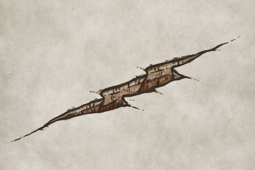
Determine the Light Source
Understanding the location of the light source will then inform where you place those three values on your drawing. Notice the amount of dimension and form being conveyed with very basic shapes and values.

The Fantasy Map Builder
$34
Compatible with Procreate, Photoshop, Affinity Photo, Clip Studio, & Infinite Painter
Easily create hand-drawn fantasy maps for your upcoming fantasy novel or next role playing campaign without learning how to draw! Includes over 300 unique features to bring your world to life.

Practice Creating Gradients
Whether you’re using a pencil, watercolor, or a stylus, put in the time to hone your skill creating gradients of shadow. You can do this with a regular pencil while you’re standing in line at the bank, or doodling on your notes during a meeting. This is one of those things that’s easy to practice, you just need to put in the time.
You’ll find that using the side of your pencil will give you more even and controlled strokes. So make sure you practice with different angles and even methods for holding a pencil.

Remember Form
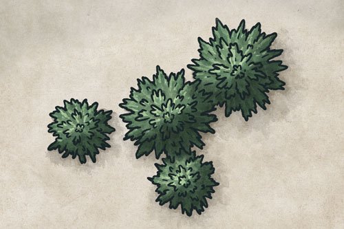
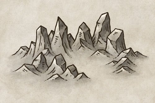
It’s simple to begin thinking about mountains as triangles and trees as circles, but when you want to take things to the next level for shading then you should start thinking in three-dimensional shapes. So, instead of imagining a triangle for a mountain, try thinking about a pyramid instead. Or instead of a circle for a tree, picture a sphere.
Then, when you draw in the details you can follow those basic three-dimensional shapes and maintain a more dynamic form. This makes shading realistically much easier.

Build Shadows in Layers
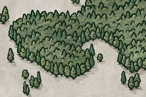
The process for shading some trees on your map with this technique is pretty straightforward. It all comes down to working in multiple passes to build up the shadows. Just make sure you have the darkest values in areas that would receive less light.

Add Complexity to Your Drawing
Now, if you understand how to add shadows to simple shapes, you can use that foundation to shade more complex illustrations. Let’s break down now how to shade a small map like this!
If you want to just practice your shading on this very illustration, you can download a free PDF of it by clicking the button below!
If you have trouble getting the download to work, just try switching browsers to Firefox, Brave, Safari, etc. and it will likely fix the issue.

First Pass - Add the Lightest Shadows
Begin as always by determining your light source; in this example it will be in the upper-left corner. Then use the side of your pencil and a light touch to block in some shadows. For the mountains you can use the main ridgeline as a guide so you can simply add some shading to the right side of that ridge. Be sure to also add some shadow on the left side of the mountains though where you see details lines as this conveys where cliffs overlap or cracks in the rock.
Then you can fill in most of the trees and add a little drop down to the right of each one to help it feel like part of the terrain. Finally, draw in some shadows around the river to give the impression of small cliffs along the shoreline.
Be sure to check out my full tutorial on How to Draw Mountains On Your Fantasy Map

Second Pass - Add the Midtones
You can now make a second pass and deepen the shadows along the ridges of the mountains, and the side of the trees facing away from your light source.
Ambient or Reflected Light
While a potentially complicated subject in itself, the main thing to remember when you’re getting started is that the blue sky all around you also produces a form of light that can fill in areas in shadow. Think about shining a light at a large white wall, and how it reflects on all the surrounding surfaces. The sky does the same thing.
Since the sky acts like a giant reflector, it adds ambient light to surfaces; particularly ones that are parallel to the sky. This is why shadows lighten near the base of a mountain and you’ll find deeper shadows near the peaks.

Third Pass - Add the Darkest Shadows
This is where you can really make your shading pop! Look for the areas in your map that would be most obscured by the direct and ambient light. Examples of this would be near the peaks of the mountains, beneath the trees, and anywhere you want to add a little more grit and texture where there are overhangs or cracks in the terrain.
One thing that is important to point out, is that you want to avoid overblending. While it’s good to practice smooth gradients as a skill, you don’t wants the shading on your map to all appear too smooth or it will look like plastic. Sharper edges give contrast, and imply an abrupt angle like you would see on more rugged mountains.
Shading does take time and practice, but once you start to get a feel for it I think you’ll find it’s very satisfying. There’s just something about drawing a a map on a flat piece of paper, and with a little shading making it look like it’s popping off the page. Don’t get overwhelmed by the process and just have fun. I hope you found this little tutorial helpful!
Happy Mapping!
- Josh