How to Draw Plateaus & Cliffs
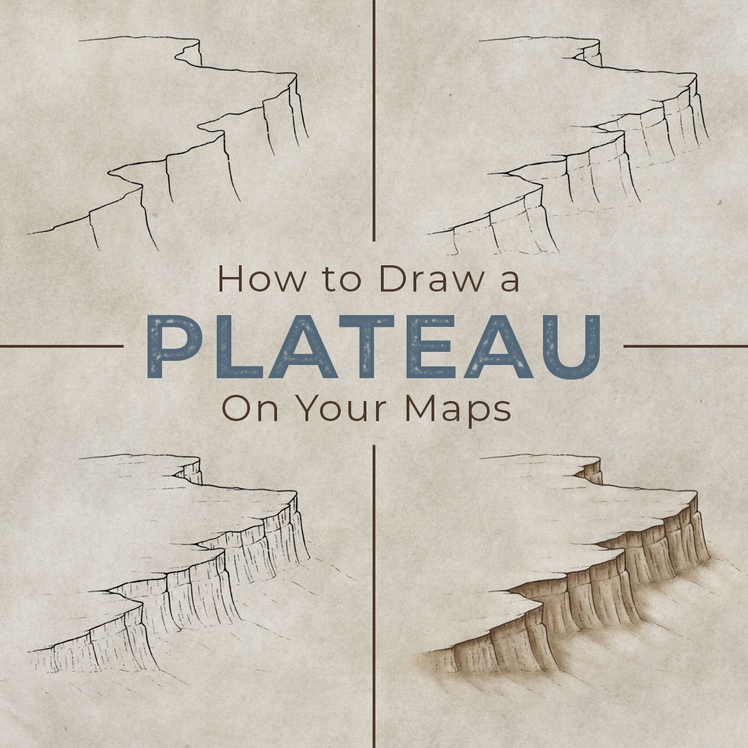
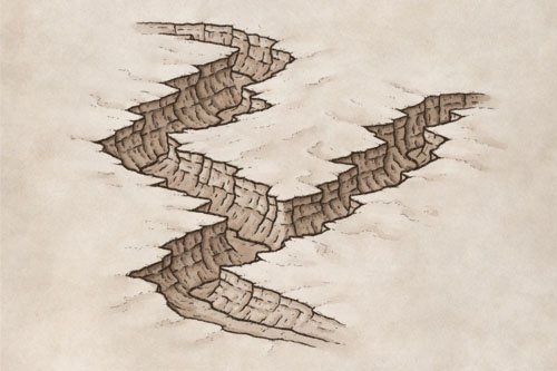
Drawing a plateau on your fantasy map is a simple way to make the landscape of your world stand out from the flat terrain you see on most maps. In this tutorial, you will learn how to draw a series of cliffs that rise out of the landscape. Which can become key storytelling features in the world you're creating for your next book or role-playing campaign.
All of the brushes I will be using for this tutorial are available in the Map Maker Essential Brushes pack for Procreate & Photoshop.
Sketch the Top of the Cliffs
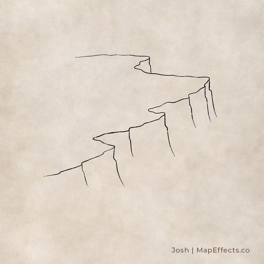
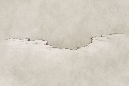
Sketch a simple line for the top of the cliffs. Don’t worry about making it look perfect at this point, you are mainly just trying to figure out the overall shape. Since this cliff will be in an isometric perspective, make sure the flows more horizontally than vertically. Think about it as using a sweeping motion from left to right in order to achieve the right perspective.
Ink Line Art for the Ridge
Create a layer or switch to an inking pen to start adding some line art for the cliff edge. Follow the shape of the line you created in the previous step, but don’t be afraid to roughen it up a bit and vary the width of the line so it feels more organic. For the line art on this tutorial, I will be using the Chalk Sketcher Brush Included in The Modern Map Maker Essential Brush Pack in the Map Effects Shop. The thing I like about this brush for drawing something like a cliff is it has some texture built into it so it looks and feels like you’re using more traditional tools.
Determine the Height of the Cliffs
You can now draw some vertical lines down from each of the main points of the ridge that you have drawn. At this point you are determining the height of the cliff, so draw the lines down to where they would meet with the ground.
You can start imagining the plateau as a three-dimensional object with some parts of the cliff being hidden by other cliffs coming in front of it. A good example of this is the point at the top which is mostly obscured by the main part of the cliff coming in front.
In this example, I have also included a slight bump out at roughly the same height as each line coming down. You’ll see why in a moment!
Draw Some Initial Details
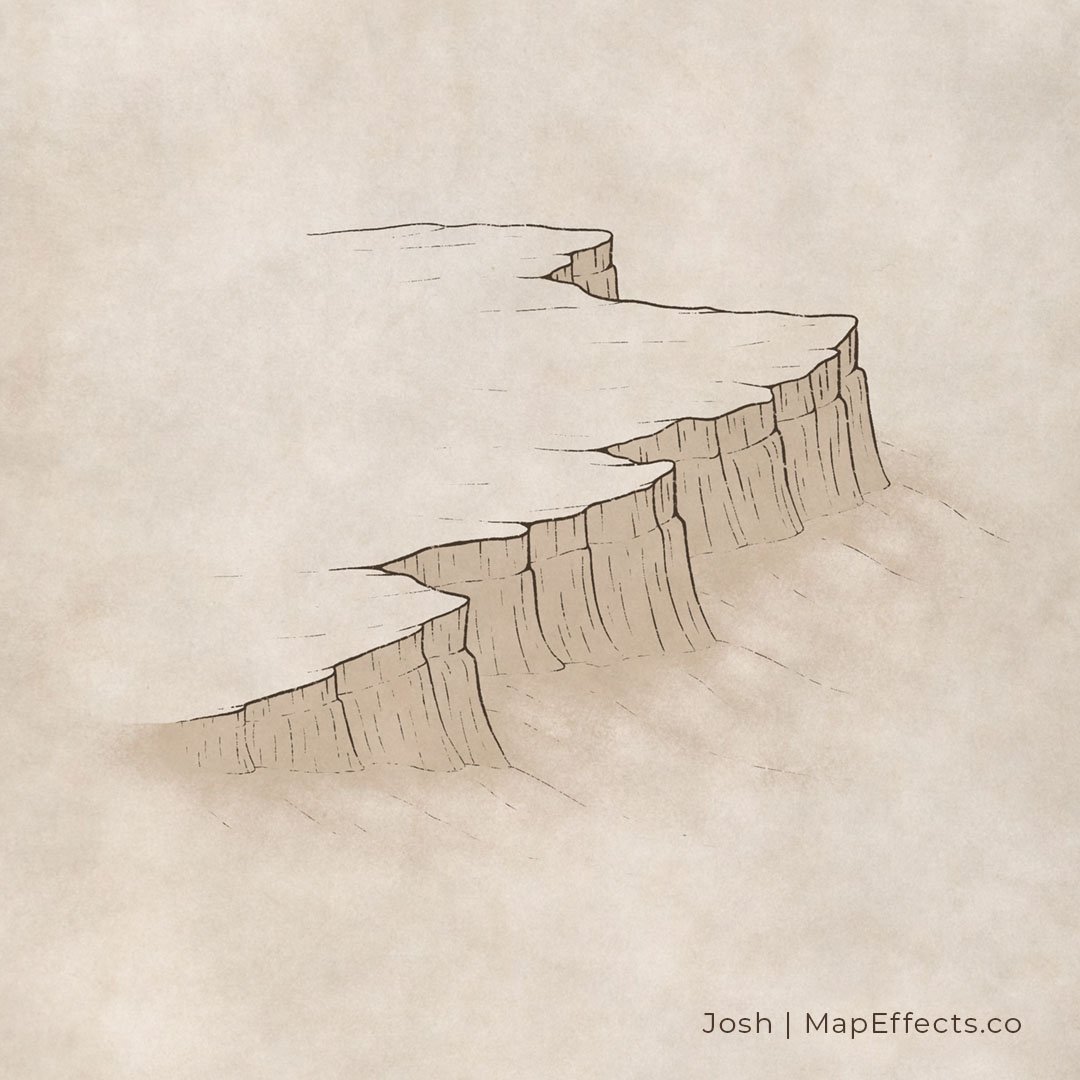
Now you can add some of the primary details on the cliff face. Add some additional vertical lines but make them more broken and subtle than the main lines you drew in the previous step. You will also want to draw subtle lines at the base of the cliff where it would meet the ground to define the shape.
You can also see that the bump out I added in the previous step has been turned into a sedimentary layer for more visual interest. If you choose to do this as well, you want the layer to appear roughly the same thickness along the cliff.
Finish Adding Details for Texture
Keep adding vertical lines on the cliff face until you are happy with the overall look. It is easy to go a little too crazy with this though, so you may have to go back and erase if an area starts looking too busy. The main thing you’re doing at this point is just giving a bit more texture to your cliffs.
You can also add some subtle sloping lines down from the bottom of the cliffs. This helps to blend it more naturally into the terrain. You can also add more horizontal lines at the top of the cliffs to blend it into the surrounding landscape.
More Tutorials You May Enjoy
Paint Some Base Shading
Now that all the line work is done, you can start painting in a base color on the cliff face. For this example, I went with a fairly sandy sepia tone in order to match the aged paper texture of the background. But you could use more of a gray depending on the type of rock you want to convey.
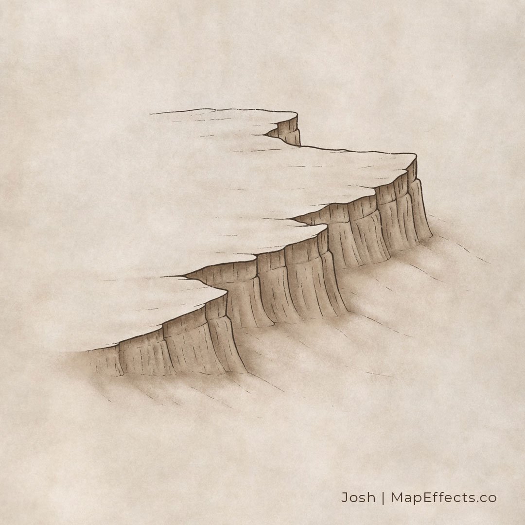
You can also take your base color and add a bit of it on the slopes at the base of the cliff. Make it darker where the cliff contacts the ground and then blend it out from there. You can do this with a lower opacity brush or using a pressure-sensitive stylus.
Deepen Some of the Shadows
With a softer textured brush, you can add subtle shadows below the top of the ridge and along the vertical lines running down the face of the cliff. Adding shadows where things overlap is a simple way to give a sense of depth. Just keep your light source in mind and imagine where the light would be most obscured by the cliff and the ambient light from the sky.
The brush I’m using for this step is The Rock Climber Filler, which I designed to have a bit of a stone texture built into it. This really speeds up the process of making the shading look more organic and natural.
Paint the Highlights
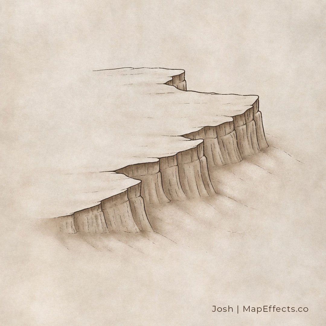
Now that you have added all your shadows, you can now add some subtle highlights. It is important to keep in mind the surface and texture of what you a painting. The sandstone type of rock in this example is not as reflective as water or even a harder type of rock like basalt. So you want to be pretty subtle with your highlights or else it will look unnaturally reflective.
Based on the shadows, the light is obviously coming from an upper left corner, so it would be appropriate to place some highlights on the ground at the top of the cliff. But, you have to remember that light gets bounced around from all kinds of places, including the sky and clouds. So you can also add some more subtle highlights on the cliff itself, particularly where the rock juts out. In this case, I have also added a little bit of a highlight along the base of that sedimentary layer to give the impression of a slight ledge.
Now that you have a better idea of how to draw plateaus and cliffs, you can incorporate them in a variety of ways into your fantasy maps. You can add a city or some type of fortification on the top of the cliff, or add a waterfall spilling over the edge with a river winding away at the base. Just have fun with it and you’ll start to see all the options that open up for you.
Be sure to check out the Learning Section for More Cartography Tutorials and Tips!
Happy Mapping!
- Josh

