
How to Draw Forests - Top Down Perspective

You’re city or village map is just about done, but you need to add some trees to breathe some life into the surrounding landscape. In this tutorial, I’ll show you how you can draw some simple trees that will stand out and really make your fantasy map pop!
All the brushes used in this tutorial are available in The Cartographer’s Liner Brush Field Kit for Procreate & Photoshop

1: Sketch Tree Shapes
Draw some basic circles of various sizes to get a sketch of the location and size of the trees. It’s a good idea to try and have some variety in how large you make the trees so it doesn’t look unnatural.
Don’t be afraid to allow them to overlap a bit. We’re drawing a forest here, not a Christmas tree farm where everything is evenly spaced!

2: Draw the Tree Shapes
If you are working digitally like I am, create a new layer above your sketch and draw in the shapes of the three trees. You’ll want to use a small circular stroke, almost like you’re drawing a cloud. Just be sure to vary the direction and the size a bit so it feels like branches.
I like to use a broken line as well where trees meet so their branches look like they’re blending together. This helps break up an otherwise hard edge.
For the line art, I have switched to my Ancient Stone Brush because it’s pressure sensitive so it’s easy to very the line weight like you would with a traditional brush pen. Once again there is a little texture baked into the brush so it looks and feels more like traditional tools.


3: Add the Branch Details
Continue to use the same stroke pattern how to draw the remaining details on the tree. I like to start at the top and work my way down the tree but do whatever feels comfortable for you. Just be sure to follow the roughly circular shape of the tree.
TIP ON SCALE & DETAIL
It’s easy to go a bit crazy with detail at this point, but that may not be best for your map. If you are doing trees like this for a battle map or something that is much more zoomed into a region, by all means, use more detail.
But, if you’re drawing trees for something like a city map like I am here, it’s actually better to use some restraint and only add enough detail to give the impression of a tree. The trees are not the focus of your map, they’re texture.
More Tutorials You May Enjoy


4: Block in the Main Color
Create another new layer below your line art if you’re working digitally, and begin blocking in the main color of the trees. For this example, I am using a more neutral green that will look good with the aged-paper background.
The other thing you can do if you’re in Procreate or Photoshop is to recolor your line art from black to a darker green. This just helps soften the colors and bit and makes it look a little more professional.
To recolor the line art just pick your line art layer and set it to Alpha Lock. This will only allow you to color on the pixels already present on the layer. Select a darker green and go for it!
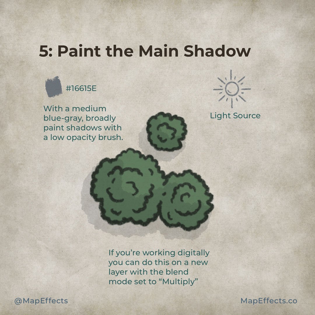
5: Paint the Main Shadow
Now it’s time to make these trees come to life with some shading. Create another layer above your color layer and set the blend mode to “Multiply”. Then, select a blue-gray color and broadly paint shadows with a low-opacity brush.
Be sure to keep your light source in mind and don’t get too caught up in details at this point. You are just focusing on the main shadows that would be cast from the trees.
For this step, I’ve switched to the Heavy Marker Brush in my Liner Brush Field Kit. I really like this brush for shading because it’s pressure sensitive, has an interesting edge, and has a little texture baked into it.


6: Deepen the Shadows
Now you can make a second pass to deepen some of the shadows where the light would be most obscured. Use your line art as a guide to where branches would be overlapping and causing a deeper shadow.
You can use a smudge tool as I did here to soften the edges of the shadows just a bit. Don’t go crazy though or it will start to look overly “digital”.

7: Paint in Some Highlights
Now we’re on to the last step where things really start to pop! Just create one more layer above your shading layers and set the blend mode to “Add” or “Screen”. With the shape low opacity brush, you can now paint some warmer colors to the side of the trees that would be directly in the light.
Experiment with the overall opacity of the brush and the layer itself until you find something you’re happy with.
TIP ON BLEND MODES
“Add” and “Screen” are the main blend modes I use to add highlights. “Screen” tends to wash out most of the saturation while brightening the overall value, while “Add” brightens the values while adding a bit more of the hue you’re painting with. Since I wanted a little warmer light source I decided to use “Add” in this example.
You’re done! If you found this tutorial helpful be sure to follow MapEffects on Instagram and tag me with the map you create and I may feature your work. Thank you, and I look forward to seeing your map!
Josh
