
How to Draw a Banner

Learning how to draw banners is an essential part of creating an immersive fantasy map. You can use them to share the name of the region you’re mapping, or for individual cities, locations, or territories.
However, learning to draw banners can feel overwhelming if you’re not confident in your artistic skills. In this tutorial I want to walk you through how to draw a relatively simple banner anyone can draw, that still looks interesting and professional. Let’s start mapping!
All of the brushes I will be using for this tutorial are available in The Free Apprentice Brush Pack

Sketch the Main Shape
Roughly pencil in the main shape of the banner on your map. At this point, you’re just drawing the space where you’ll want the title to appear.
For this first banner tutorial, use a basic rectangle without any major arc. Then, you don’t need to worry about distorting the letters later to properly fit the shape of the banner.

Add Top of the Banner
Next, you can draw just the top edge of the scroll and determine how you want the paper to curve. Don’t be afraid to experiment, and let the banner overlap itself in places to give more depth.

Sketch Vertical Lines
Now add downward lines that angle in the direction of the curve, and then taper out slightly at the base. Be sure to avoid making the lines too straight up and down.

Connect the Base
Draw a curving line to connect the bottom of the banner and close in the shapes. Notice the bottom curve mirrors the curve at the top. While they don’t need to be exactly the same, try to keep the curve similar.
More Mapping Tutorials


Give the Banner Weight
This step isn’t “necessary”, but I find it’s a good trick to give more of a 3D look to the banner by giving the paper a sense of thickness

Ink the Line Art
Grab a pen and ink over your sketch, but be sure to add some subtle imperfections or tears in the paper to add visual interest.
It’s okay if your line isn’t absolutely perfect because it will add to the tattered feel of the banner.
You can get the Ink brush I’m using for Free HERE in the Apprentice Brush Pack.
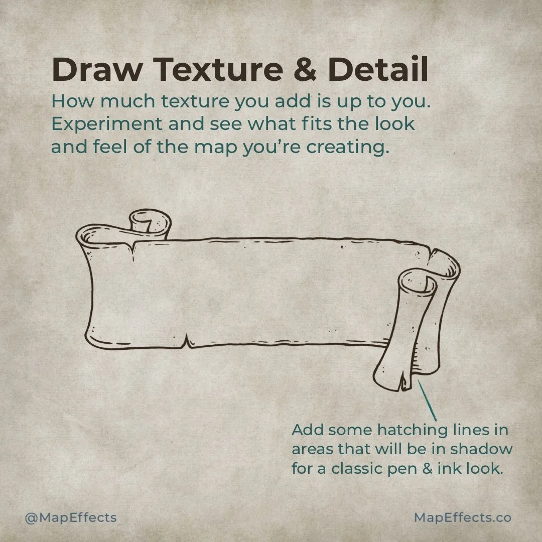
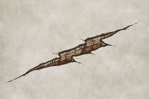
Draw Texture & Detail
How much texture you add at this point is really up to you. So experiment and see what fits the look and feel of the map you’re creating. With that said, you will probably tend toward overdoing it!
Add some hatching lines in area that will receive the least amount of light. This will give a little bit more of a classic pen and ink look.

Block in Color
If you are working digitally, use your color picker and select a lighter value from somewhere on your map. You can adjust it a bit as needed, but this will make up the base color of your banner.
You can paint the whole banner one color, or use a darker, more saturated color on the back of the paper to add a visual color pop. This can be a good way to also introduce an accent color that fits the color palette of your map.

Shadows - Phase I
Select a sepia color (#C8A793) to match the palette and create a new layer with the blend mode set to “Linear Burn.” Then use a low opacity brush to paint some simple shadows based on your light source. Look for corners and places the paper overlaps.
You can get the shading brush I’m using for Free HERE in the Apprentice Brush Pack.

Shadows - Phase II
Use the same brush and color as the previous step, and make another pass to darken the shadows in areas most obscured from the light source.
Use a smudge tool to blend some of the shadows, but avoid making them look too smooth or it may look “digital”.

Shadows - Phase III
Paint a bit of shadow on the main banner just to give some texture and character so it doesn’t look too uniform. Add a drop shadow below your banner so it feels connected to the rest of your map.

Add the Highlights!
Create a new layer and set the blend mode to “Add” or “Screen”. Your results may vary depending on the app you’re using.
Paint along the top of the banner so it looks like the light is catching the edge. You can also add subtle highlights near the base where the paper is subtly curling up and catching the light.

Add a Title
It’s finally time to add the name to your banner! Type out your title and experiment with the blend modes. In this example I felt “Linear Light” was giving me the best result since it allowed the underlying texture and shadowing to bleed through.
If you want to pick up the font I’m using, just tap the link below:

Finishing Touches
Just to bring everything together, you can take your same line art brush and do a simple outline of your text so it has a cohesive, illustrated feel.
Lastly, use a layer mask by tapping on the text layer and selecting “Mask”. You can then use the color black to erase the corner of the “R” that is hidden by the banner.
The advantage to doing this rather than just erasing is that if you use white to paint on the mask you can brush back anything you erased. It’s just a good, non-destructive way to work in certain situations.
