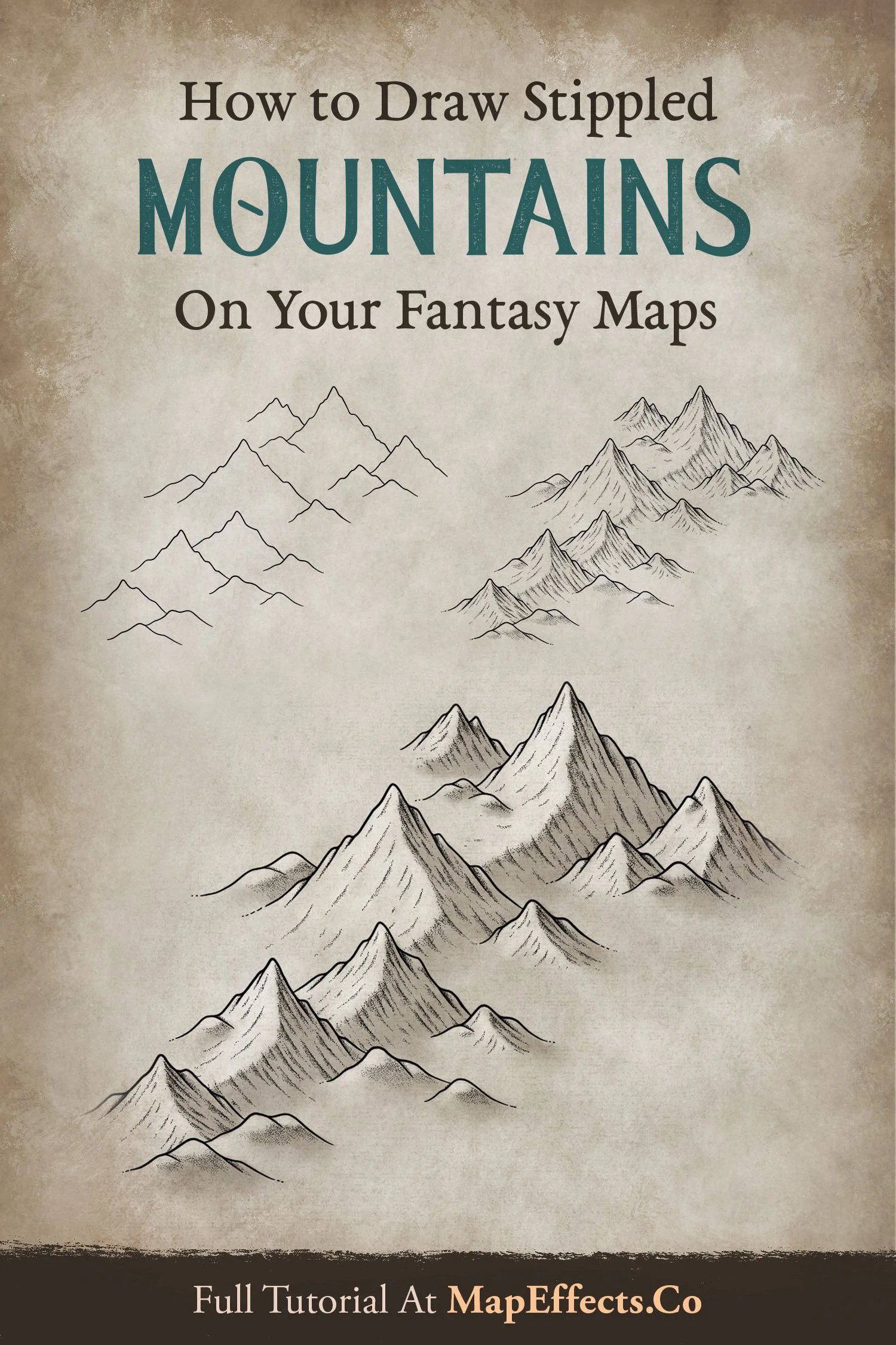
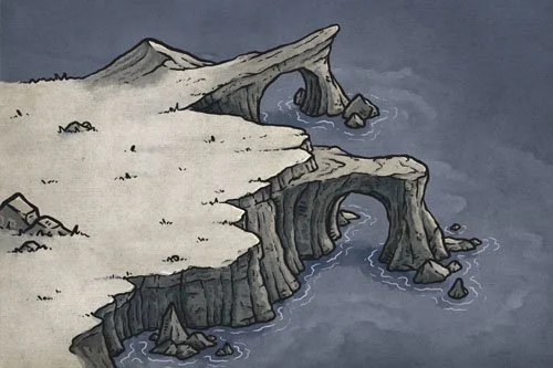
How to Draw Stippled Mountains
Mountains are perhaps the most important feature of a map. They play a significant role in dictating the climates of different regions, and they act as natural barriers to separate nations and regions. There are many ways you can draw mountains on a fantasy map, but this method will walk you through how to use a traditional stippling technique which brings a bit of a Victorian aesthetic to your modern fantasy cartography.
All of the brushes I will be using for this tutorial are available in The Modern Map Maker Essential Brushes pack for Procreate & Photoshop.
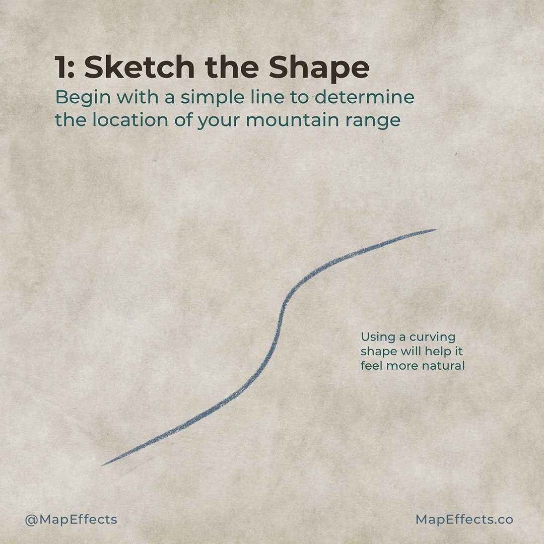
Sketch Where You Want to Place the Range
This may seem unnecessary, but by just drawing a line where you want the mountain range to be will often save you time in the long run. It will allow you to focus early on placement and composition rather than getting lost in details and having to redo them when you recognize a problem.
Try to use a natural flowing shape as well rather than something with abrupt angles. This is the first step is making your mountain ranges feel more realistic.

Sketch the Mountains
Again, you want to keep things very simple at this point so that you can focus on composition. You don’t need anything fancier than triangles of varying sizes placed along your sketch line. Anything more than this and you may become too attached and unwilling to erase even if it’s in the wrong place!
You also generally want to put the tallest mountains along the middle of that line and have them taper into the landscape from there. Having all of your mountains the same size is a common mistake that can be easily remedied.

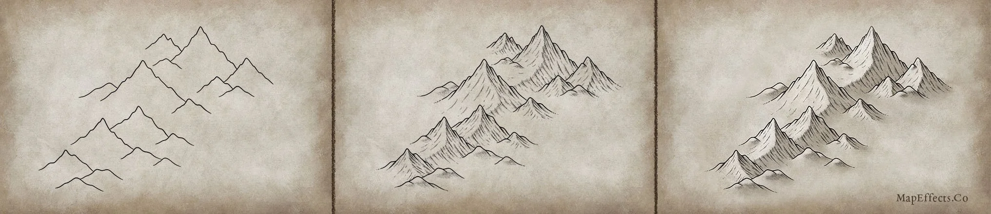
Draw the Basic Line Art
Now that you are happy with the shape of your mountain range, you can begin adding in the actual line work that will define each mountain. If you are working digitally, just create a new layer above your sketches and begin to draw the final line work.
For this particular style you will want the shape of the mountains to have multiple secondary peaks and look a little bumpy. The peaks or bumps should be sharper and more dramatic on larger mountains, with them gradually smoothing on smaller mountains or foothills.

Add Lines to Give Depth
Your mountains should have a fairly jagged edge to them, so now you can add some simple lines to separate each point from the main mountain. This will give good depth and sell that rocky feel we are going for.

Add Temporary Ridges
On a separate layer or with a pencil you can now draw a temporary ridge which connects the mountains to one another. This step is optional, but I find it helpful as it helps me be more consistent in making sure my ridge line has a nice organic shape.
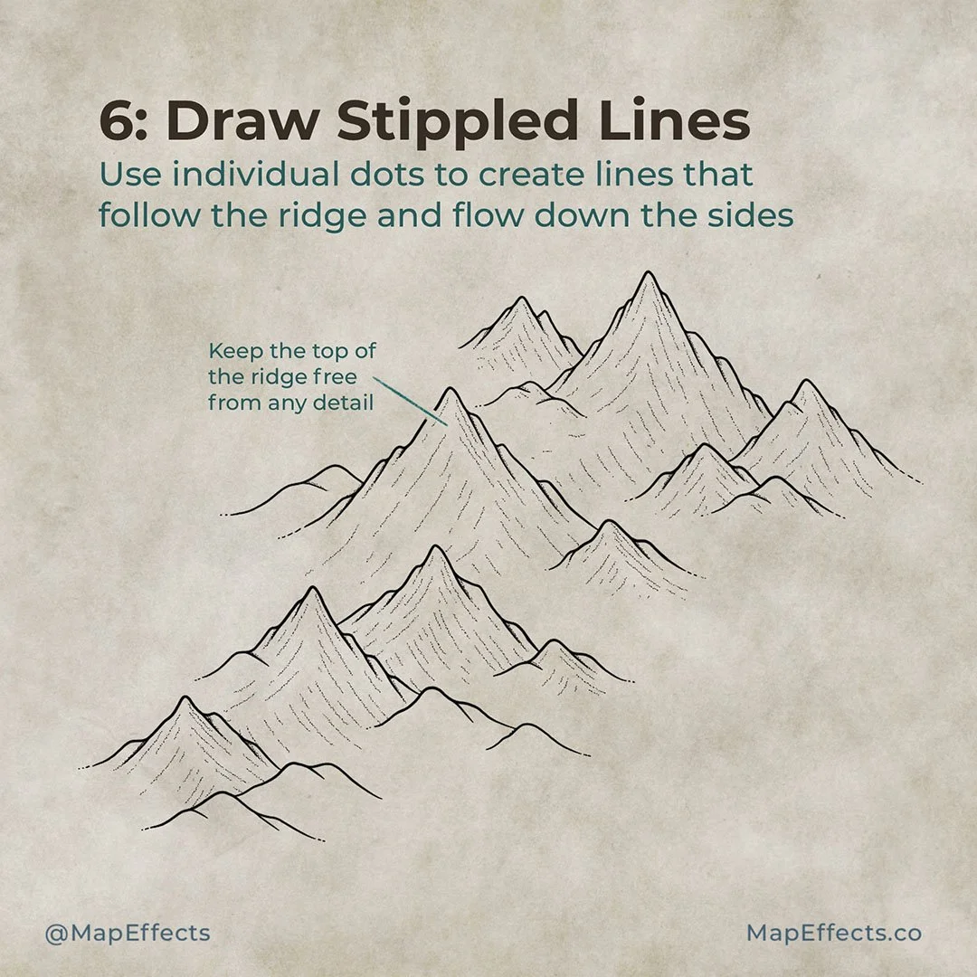
Draw Stippled Lines Down the Mountains
Using individual dots (stippling), you can now add some simple lines down from the ridge of each mountain. Make sure they don't meet at the ridge or you'll end up with a harsh edge. A characteristic of this style is that the ridge line connecting the mountains is not defined by a line, but the absence of one.
Shading with stippling and and each individual dot is known for being an exercise in patience. While I enjoy that at times, I have simplified the process by creating a stipple brush in Procreate to speed up my workflow. This allows me to draw a line which appears as randomized dots.

Deepen the Shadows with Stippling
If you are new to stippling, you are essentially shading with the density of dots. The more dots there are in an area, the deeper the shadows.
You can begin adding dots on the lower side of each line you added in the previous step. Then draw some more near the top of the ridge as well, but keep them pretty loose to prevent too harsh of an edge.
Be sure you add more stippling to the shadowed side of the mountain and keep it pretty minimal on the side where the light would be hitting. Direct light tends to wash out details because it fills in the shadows.
More Tutorials You May Enjoy


Paint Basic Shadows
The nice thing about the stippling is that you really could be done without adding any other color or shading. But, if you want to add an extra pop you can use your eyedropper tool and grab a color from the background paper texture. Then just darker it a bit and lower the saturation to get the color you will shade with.
I am using a textured brush and painting on the shadowed side of the mountains and blending into the landscape. You want your deepest shadows to be near the peaks and flow down from there. You can see that just this goes a long way to helping the mountains to really begin to stand out.

Add the Highlights
Now that you have added your shadows, you can add a touch of highlights to the opposite side of the mountains. Once again I would pick a color from the background texture and lighten it up a bit. I wouldn’t use pure white though because it will cause the mountains to look unnaturally reflective.
Makes sure the brightest highlights should be near the peak of the mountain where light would be hitting most directly. You can then begin adding highlights along the ridge line that connects the mountains to one another, and then down the side of the mountain.
Mountains were the feature I had the most trouble learning in the beginning, but with practice they are probably my favorite feature to draw. You will find that they really do set the tone for your maps and dictate where rivers go, when deserts form, and they often heavily impact the geopolitics of the world you are creating. Taking the time to figure out where to place them can go a long way in creating a believable map.
Bonus Tip - Copying
If you are having a hard time getting the shape of the mountains right, I would highly encourage you to copy one of these images and literally trace it over and over until you get a feel for it. There’s nothing wrong with copying for the purpose of learning; because once you understand the principles you can take them, adapt them, and really make it your own.
If you found this tutorial helpful be sure to follow MapEffects on Instagram and tag me with the map you create and I may feature your work. Thank you, and I look forward to seeing your map!
Josh