How to Draw a Barrow Icon
You will find barrows and burial mounds throughout the real world as the final resting places of rulers, warriors, or even groups of people. Drawing a barrow on your map gives a sense of realism and implies a more vibrant history of the world you’ve created. In this tutorial, you will learn how to draw a barrow and add a new level of intrigue to your map.
All of the brushes I will be using for this tutorial are available in the Map Maker Essential Brushes pack for Procreate & Photoshop.
Sketch the Shape of the Barrow
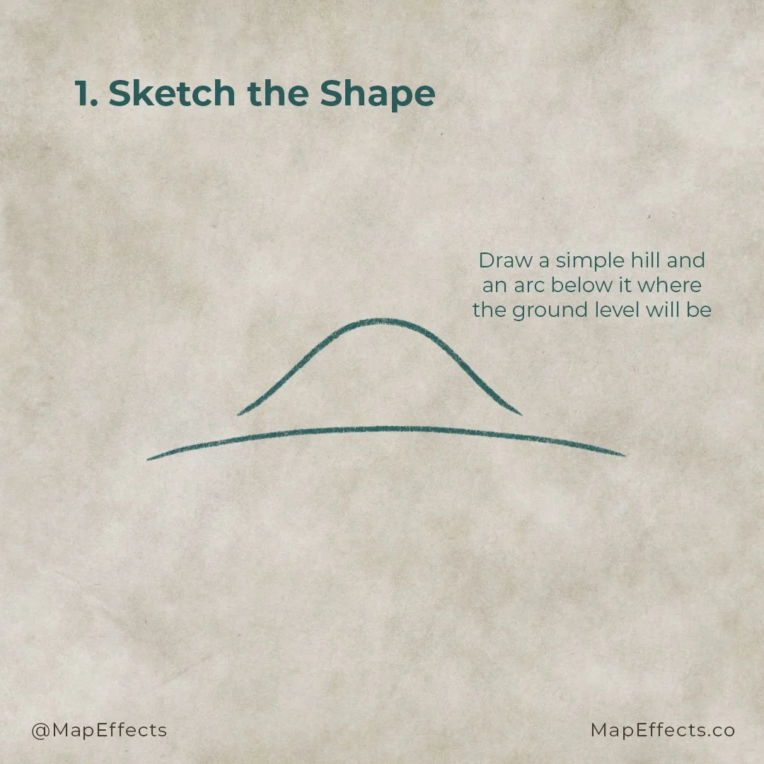
Begin by sketching a simple hill shape for the barrow and add an arc below where the ground will be. The barrow will be in a side-view perspective as if you are looking at it from ground level. These lines will only serve as a guide, so make sure you create them on their layer if you’re working digitally or use a pencil.
Add a Stone Ring
Create a new layer and draw stones in front of the barrow hill. Be sure to make the stones look a little jagged and rough, so they look hand-cut and weathered.
Draw in the Barrow Mound
The next thing to do is make the barrow hill look a little more grassy, and to add the entrance. Use rough vertical strokes to give the natural texture to the barrow. Don’t worry about it looking too perfect as it should have a sense of randomness.
Add a simple rectangle to create the entrance of the barrow. Then add some stones to the sides and top to frame it. You can also see that the opening is set a little higher than the first stones you drew to give a bit of depth.
More Tutorials You May Enjoy
Add the Final Details
With the shape of the barrow done, you can flesh out the final details to give the illustration more texture. Begin replacing the sketch line for the ground with some more vertical strokes to give the impression of grass in front of the stones. Then you can add a few random tufts of grass to the barrow on the hill to give it some extra interest.
The next thing is to give some texture to the stonework. For this, I used more circular subtle shapes to make the stone look pitted. It’s essential to vary your line width to make it feel more subtle and realistic.
Block in the Main Colors
With the line work of your barrow done, the next step is to add some color. Since we are using an aged paper texture for the background, we will use that as our base so that our color pallet matches.
Use the eyedropper tool and select your background color. Then shift the hue toward the green region of the color slider. Then create a new layer below your linework and set the blending mode to “Multiply.” This will allow you to paint in some darker color while still being able to see the texture of the background.
For the stones, you can again select the background and lower the saturation of your color. Create another new layer separate from the grass and block in color for the stones.
Paint in Your Shadows
The next thing to do is give the barrow some form and dimension with shading. Determine where your light source is coming from and imagine where the light is hidden. In this case, the light is coming from the upper right, so the shadows should be primarily on the left side of the hill.
Create new layers above your color layers and set the blending mode to multiply or linear burn. You can continue to paint with the same colors as the previous step as the layer will continue to darken wherever you paint. The primary thing you will probably have to play with is the saturation level.
Imagine where the light would be hitting, but also consider adding some shadows where one object overlaps another. This will help give some more dimension between objects.
Paint in the Highlights
Last but not least, you can add a pop of highlights to your illustration. Without them, it may look a bit drab and flat. But be careful not to be heavy-handed with highlights, or it may cause the barrow to look reflective like metal. The grass and stones have more of a matte surface, so the highlights will not be as intense.
For this step, you will want to create new layers above your color layers, but this time set their blending mode to “Screen.” Remember, the light source is coming from the upper right, so add the strongest highlights on the right side of the barrow and the tops of the stones. You can add a few pops of highlights in the grass using a jagged stroke to give a bit of randomness.
If you found this tutorial helpful be sure to follow MapEffects on Instagram and tag me with the map you create and I may feature your work. Thank you, and I look forward to seeing your map!
Josh


