Varying the Size of Mountains
What's the trick to making your mountain ranges look more realistic on your fantasy map? One thing often overlooked is that not all mountains should be the same height. Having some variation helps them feel a part of the surrounding landscape and not just sitting on top of it. Let's look at some simple principles you can apply to your maps.
Keep Three Sizes in Mind
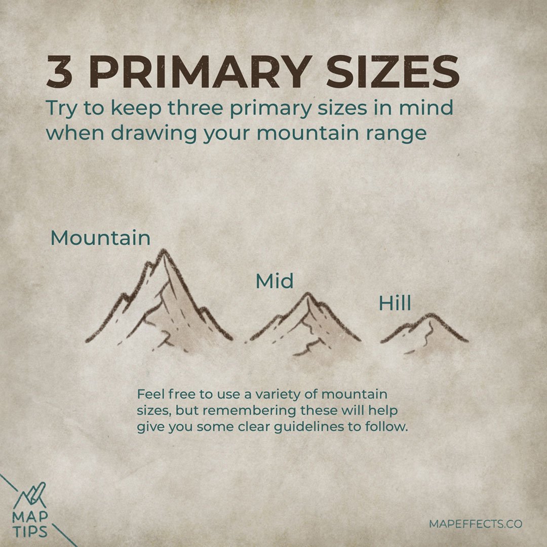
The first thing to do is try and keep at least three main-size mountains in mind. Your main “iconic” mountains will be the largest, but don’t forget to include some smaller mid-size mountains, as well as some foothills.
Start with the Biggest Mountains
The first thing you want to do is draw the tallest mountains along the middle of the ridgeline. Scattering them around randomly will quickly look unnatural.
Cartographer’s Liner Brush Field Kit
$29 | For Procreate, Photoshop, & Clip Studio Paint
Want the brushes I am using for this Map Tip? The Cartographer’s Liner Brush Field Kit contains 21x unique liner brushes designed to give an analog quality to your digital work.
Work Your Way Down
With your tallest mountains in place, you can then gradually make them smaller and smaller by adding some midsize mountains, and finally foothills. This really helps to blend everything together more seamlessly on your map.
Want to Learn How to Draw Mountains?
If you want to learn how to draw mountains on your own fantasy maps, check out this tutorial to help you put pen to paper!
I hope you found this little Map Tip helpful in your journey to map your story. If you want to support Map Effects and help other map makers, be sure to share this with someone who will find it helpful and pin it to save for later!
Happy Mapping!
- Josh


