How to Draw Better Dead Trees
Have you ever tried to draw some dead trees on your fantasy map and realized it just looked like a tree without any leaves? How can you convey that it’s actually dead and not just defoliated? In this Map Tip we’ll look at some simple tricks you can use on your maps to make sure your trees are appropriately deceased.
Broken Branches
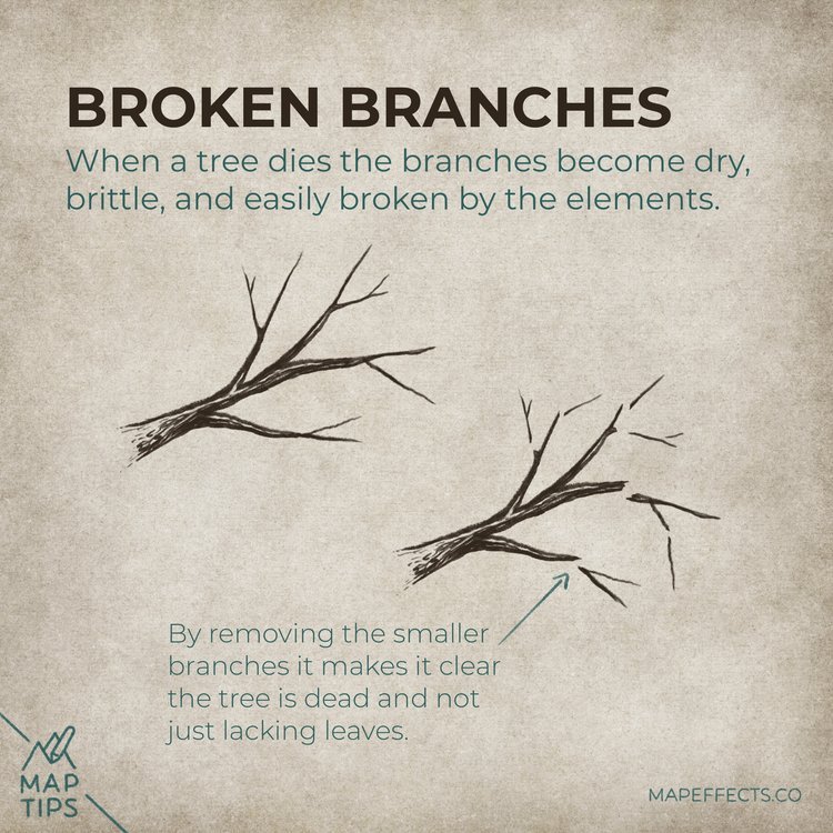
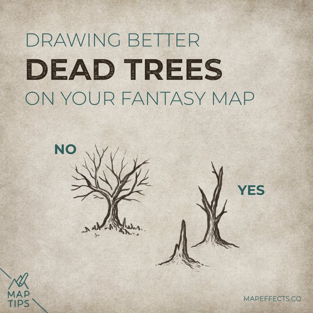
When a tree dies the branches become dry, brittle, and easily broken by the elements. Removing the smaller branches it makes it clear the tree is dead and not just lacking leaves.
Strive for Clarity
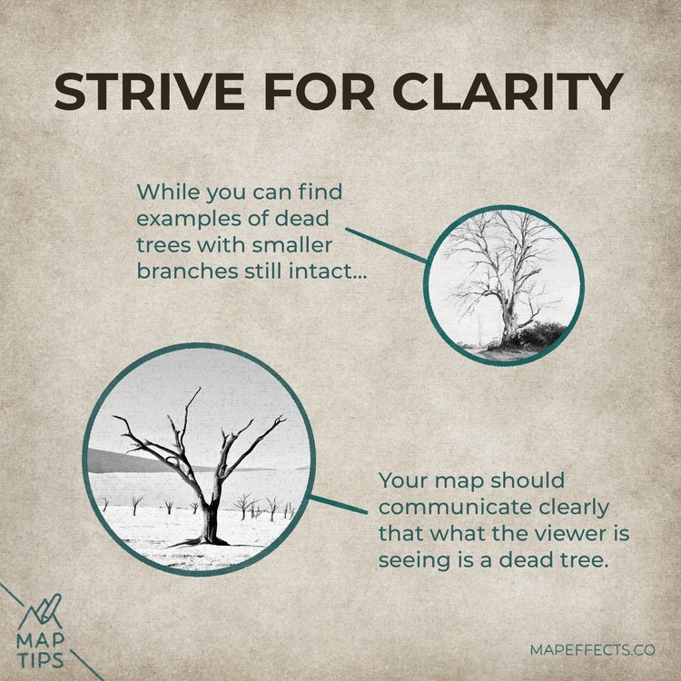
Just do a search for “dead trees” and you will certainly see examples of trees with smaller branches still intact.
But, the goal of your map should be to communicate clearly that the viewer is seeing a dead tree.
Cartographer’s Liner Brush Field Kit
$29 | For Procreate, Photoshop, & Clip Studio Paint
Want the brushes I am using for this Map Tip? The Cartographer’s Liner Brush Field Kit contains 21x unique liner brushes designed to give an analog quality to your digital work.
Practice as if You’re Pruning a Tree
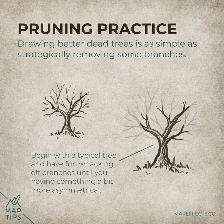
Drawing better dead trees are as simple as strategically removing some branches. A great way to practice this is, to begin with a typical tree and have some fun whacking off branches until you have something a bit more asymmetrical.
Bring it Together on a Map
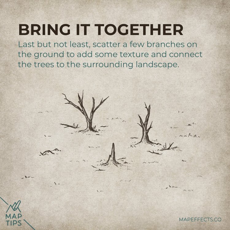
Last but not least, try scattering a few branches on the ground to add some texture and connect the trees to the surrounding landscape!
I hope you found this little Map Tip helpful in your journey to map your story. If you want to support Map Effects and help other map makers, be sure to share this with someone who will find it helpful and pin it to save for later!
Happy Mapping!
- Josh


