
How to Draw an Isometric Castle
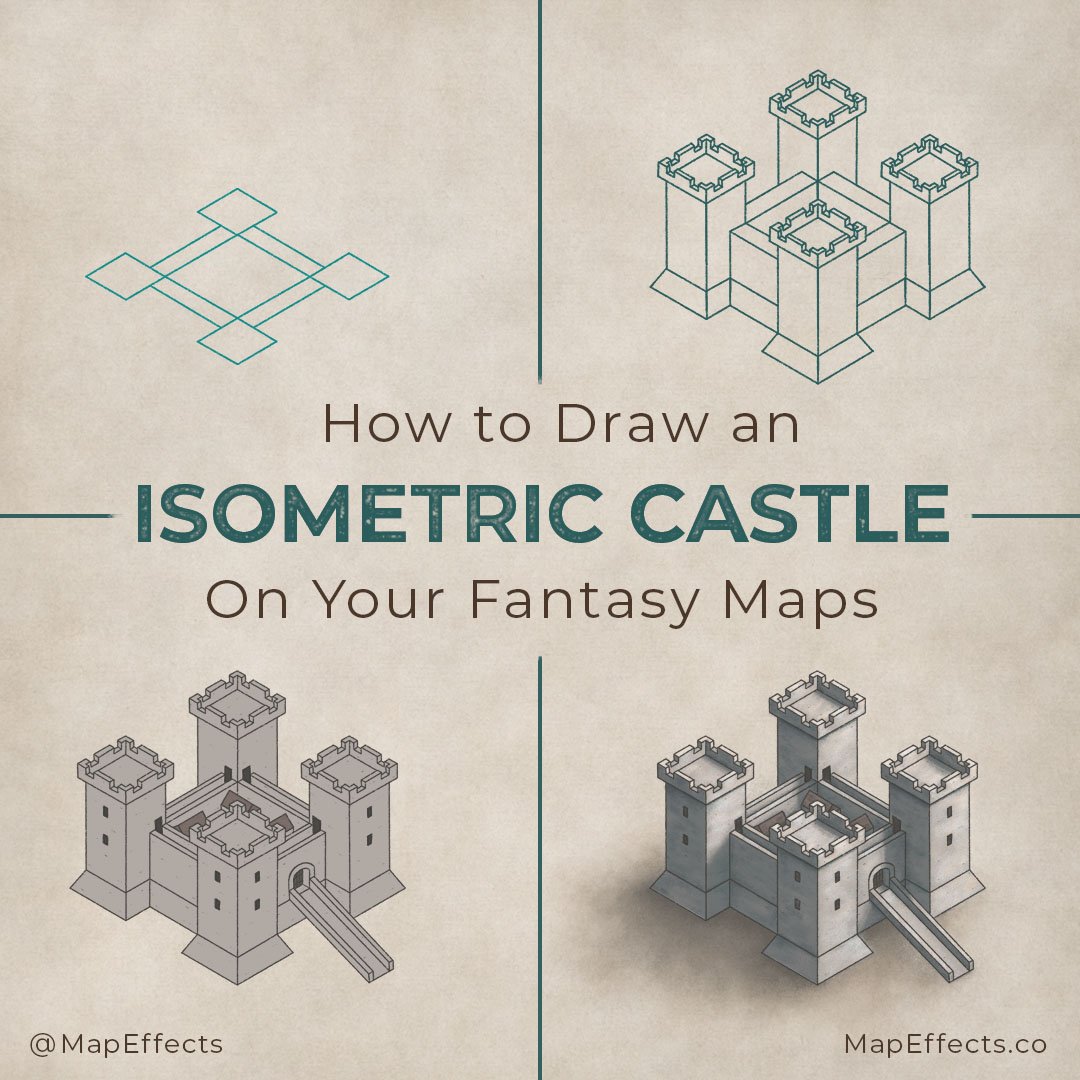
Learning to draw a castle for your maps is a great way to begin telling the story of the world you’re creating. Not only do castles act as a seat of political power for a lord in the region, but they are also an important site of trade and commerce. I have broken down the steps I take when drawing a castle so you can begin drawing them on your maps.
Also, click the button below and download a free isometric grid for this project. It will make the drawing process much easier, especially if you are new to working in this perspective. You can either print it out or bring it into your project. If you are working digitally, just add it as a new layer above your background and set the blend mode of the grid layer to “Multiply” to remove the white background.
All of the brushes I will be using for this tutorial are available in The Modern Map Maker Essential Brushes pack for Procreate & Photoshop.

Begin with the Floor Layout
The first thing we want to do is to determine the floor plan of the castle. I find it best to build your illustration from the ground up so you can get the size and proportions of the building right from the beginning.
Keep things simple at this point by drawing four squares for the turrets of the castle and four rectangles to connect them together with your walls. Just follow the grid to make sure everything lines up in the right perspective and stays consistent in size.

Expand the Base
Follow the grid and add an outline around the entire floor plan you just created. This will act as a guide for when you add the sloped base in a later step. I find it best to add this now when it is easier to see where the walls will eventually extend.

Draw in the Towers
With our foundation in place, we can now begin building upon it. Draw four turrets coming out of the squares you drew in the first step. The height is up to you but remember the wall you will add in the next step will be a little over half the height of the towers.

Add the Castle Walls
Up to this point, we have been drawing a framework as if the castle is transparent. This really helps to get a consistent form but can also get confusing to keep track of all the lines. So now I erase the lines we will no longer need to keep things cleaner.
Now that your towers are in place you can begin drawing in the walls to connect them to one another. My walls in this castle are a little more than half the size of the towers, but you can play around with this to give some variety to your castle design.
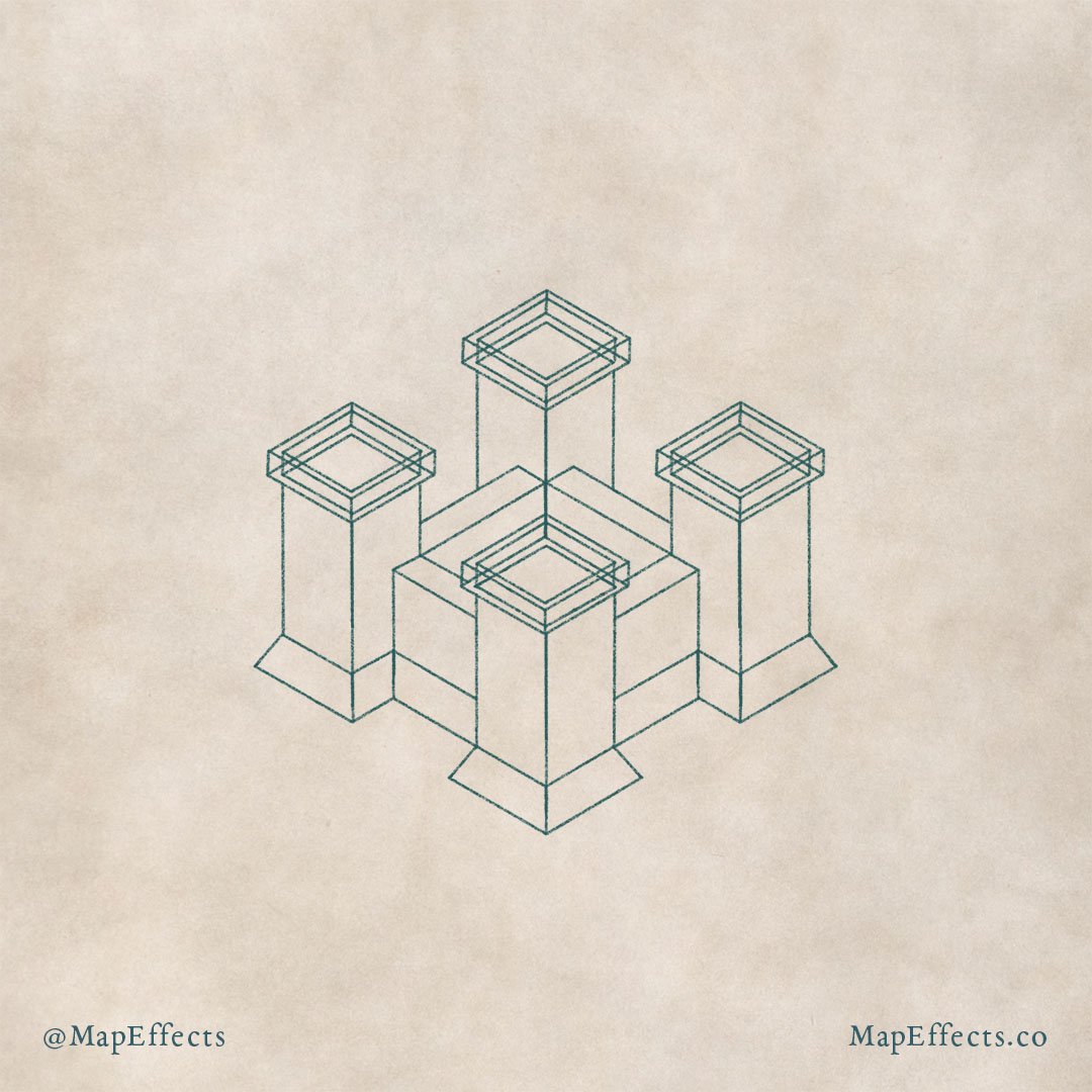
Draw the Battlements
I like to expand the battlements out beyond the towers to add some visual interest to the castle. This overhanging style is common in medieval architecture so it goes a long way in making it feel more like a castle. Make sure you continue to follow the grid and just expand it out from the tower in all directions.
Add the Sloping Base
The other thing I’ve done is that I added the sloping base which I hinted at in the second step. If you are following the grid you can just go a couple of squares up from the base of each tower and the walls and draw angled lines to the corners.
More Tutorials You May Enjoy


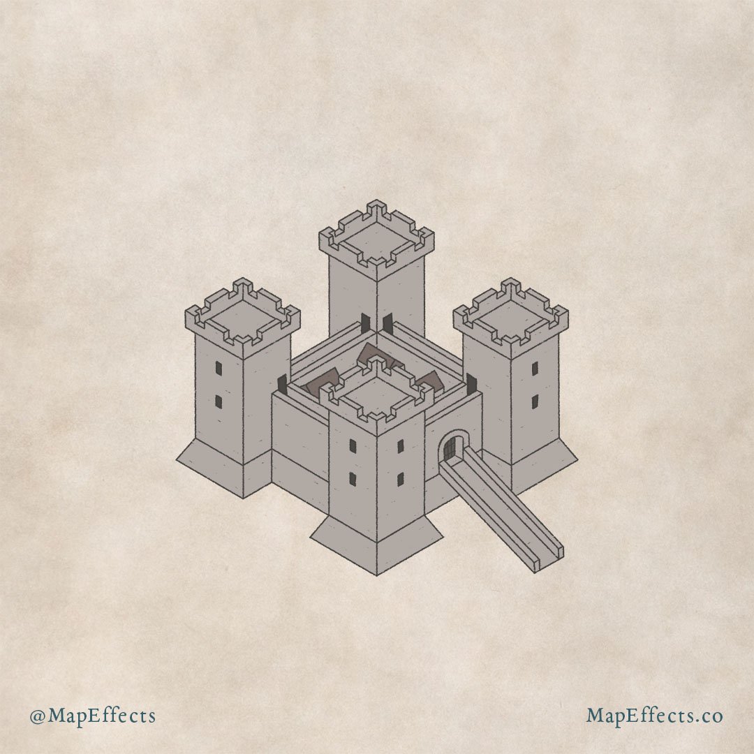
Draw the Details
With the shape of the castle in place, you can begin adding some of the little details to make it more interesting. I’ve added a ramp and a gate to the front of the castle, as well as windows and doors to the towers.
I’ve also drawn some details to the walls and turrets of the castle. On the walls, you can add a couple of simple lines to define the thickness of the wall, and indicate there is a pathway people can walk along.
On the turrets, I have added gaps or crenels which an archer would use for protection while firing. Drawing these can be a little challenging because the detail is beginning to get pretty small. But as long as you follow the perspective you have already established and imagine you are carving them out of the wall, you should be fine.

Add Roofs Inside the Castle
You could call it good at this point, but it can be fun to add some small rooftops on the inside of your city to really help it feel like there is a population with people living there.
In this case, I drew a couple of simple roof shapes outside of the castle and moved them where I wanted them on the inside. This is easy to do if you are working digitally like I am. Otherwise, you can pretty easily draw them following your isometric grid.
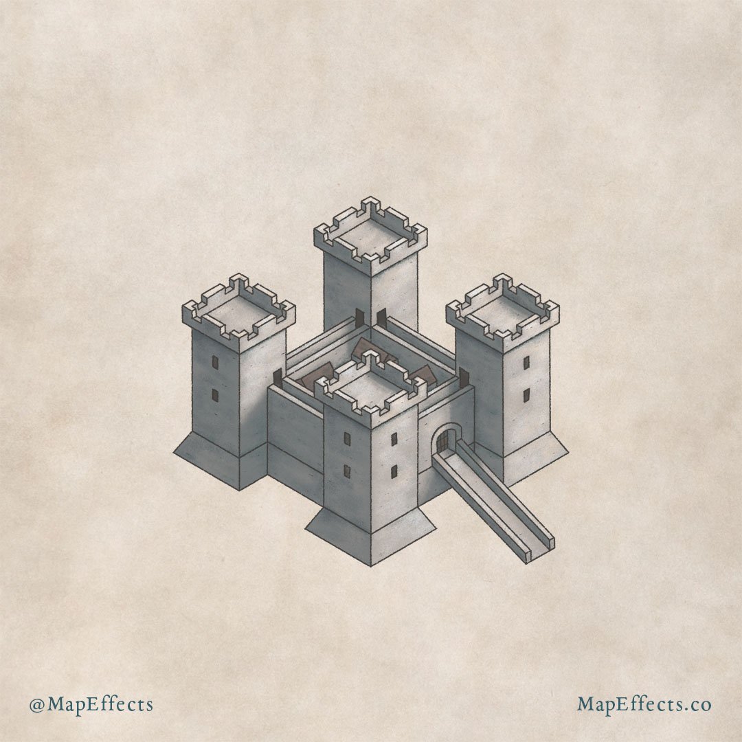
Block In the Main Colors
Because we are drawing on this aged paper texture, I will use it as my base for my color selection. I use my eyedropper tool and select the paper background, and then I bring down the brightness as well as the saturation for my main color. I then make the color much darker to paint in the windows and doors on the castle. You can then color the roofs inside the castle a desaturated brown.
Recoloring the Line Art
If you are working digitally you can also recolor your line art by turning “Alpha Lock” on for that layer. Then just paint it gray to match the castle.

Paint in the Base Shadows
In order to add shading to your castle, the first thing you need to do is determine the direction of your light source. In this case, I decided to have it coming from the right because I didn’t want the castle gate to be entirely in shadow.
At this stage, I am using a hard round brush to block in the main shadows to begin giving dimension. A helpful thing to keep in mind is that if your light source is warm, then your shadows will appear cooler. Therefore, I have taken the base color I used for the castle and have not only darkened it but also incorporated some more blue hues.
Finish the Shadows and Highlights
Adding the main shadows in the previous step went a long way to making the castle look three-dimensional, but it still looks a bit flat. Now you can go through and add those subtle details to the shading to make things pop.
The Shadows
While the shadows are in place, they still look flat because they are all even and of the same value. The first thing I do is go back through them and deepen the shadows where the shadows would be the darkest. Usually, this is inside corners, or where something is overhanging. At this point, I use a more saturated blue color in the shadows to add contrast not only with how dark the value is but also with the color itself.
The Highlights
As I mentioned before, I want a light source that is on the warmer side, primarily so it matches the warmth of the paper background. So, for the highlights, I selected a very light yellow and begin painting anywhere the light would be hitting. I make sure the highlights are brightest near the tops of the towers where light would hit directly.
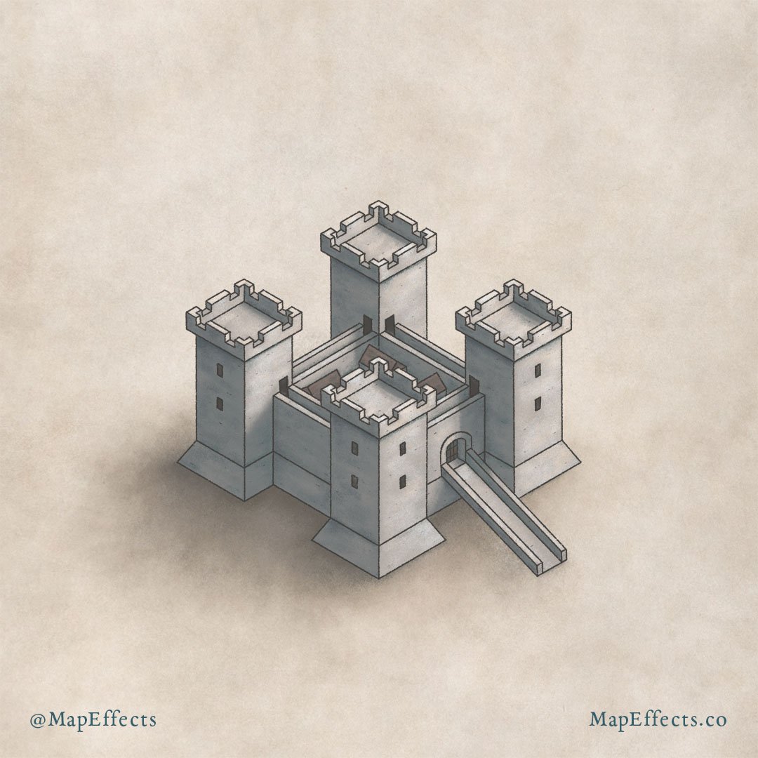
Blend with the Terrain
The castle is really coming along nicely, but there is one more important step a lot of people miss. If you want your castle to look like it’s part of the terrain and not just sitting on top of it, then it helps to paint a cast shadow.
Admittedly, I kept things pretty simple with a soft brush, but it’s amazing how much adding a simple cast shadow on the left of the castle goes to making it feel like it’s actually part of the map.
Now that you know how to draw a castle icon, I recommend checking out the blog I wrote on Where to Place Cities on Your Fantasy Maps. I’ll share with you the 7 things I consider to make my city placement realistic.
Thank you, and I look forward to seeing your map!
Josh
