Picking The Best Canvas Size for Your Map

Many of us are familiar with the stress that comes when staring at a blank page. But, the decision of how large to make the canvas you are going to draw your masterpiece on can feel equally intimidating. After all, there’s nothing worse than finishing a project and realizing you need to make major modifications so it will print the right size.
When it comes to picking the best canvas size for your map though, there isn’t a one size fits all answer. There are several factors to consider and much of it depends on how the final map will be used. All of this can feel a bit overwhelming, but with a few simple principles you can pick the best size canvas for your map. Here are three things to keep in mind when you begin a new project.
1: Determine the Dimensions of the Map

Whether it is for a personal project or a client, the first thing you need to figure out is how big the final map will need to be. If it is going to be printed you want to determine if it will be a standard paper size like A2 (16.53 x 23.39 inches), A4 (8.27 x 11.69 inches), or something else. You don’t want to have to make modifications to fit a different size document down the road, so make sure you are working on the right size document before you begin.
Figuring out the scale of your map and how many miles it is from one point to another is another important element to determine before you begin a project. You can learn more about determining the scale of your map HERE.
2: Make the Map Bigger than it Needs to be
Once you determine what dimensions you need the final map to be, then you can scale it up to have the best quality possible when it’s finished. Even if the final map will only be on an A4 piece of paper, you will still want to make it at least double that size just in case you need to make a larger print down the line. You can always scale your work down, but you cannot scale it up without losing quality. This only deals with dimensions though, and I will touch on what resolution or dpi to use a little later.
If you are working on traditional paper it is still advisable to draw the map bigger than it needs to be just in case you want a large print to adorn the wall. This may mean purchasing larger sheets at a craft store and getting your map scanned by a professional printer. Or drawing on multiple standard sheets of paper, scanning them yourself, and stitching them together on your computer.
But...if you do work at a larger scale like this then there is a danger to keep in mind, which leads to #3.
3: Print Samples!

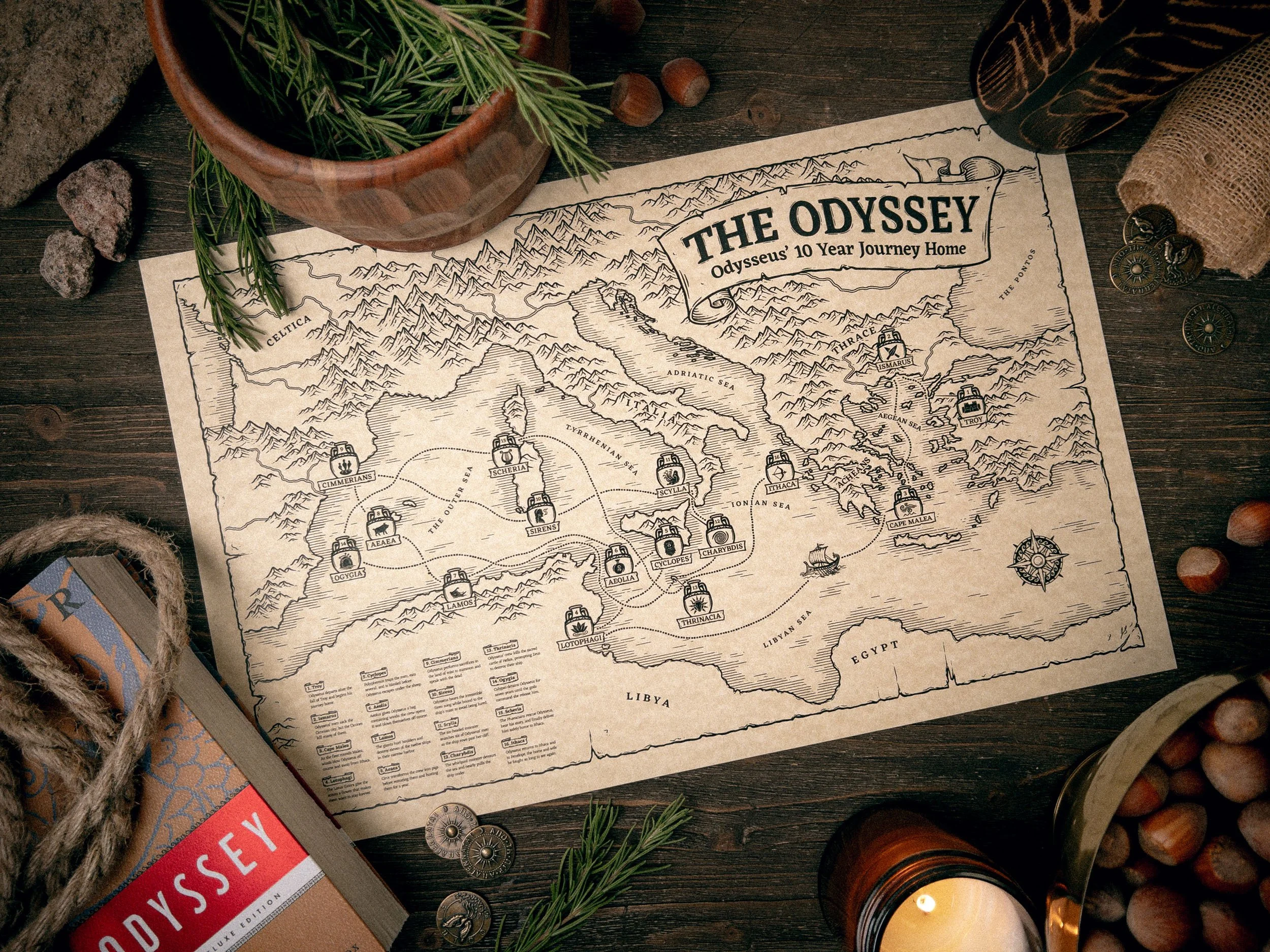
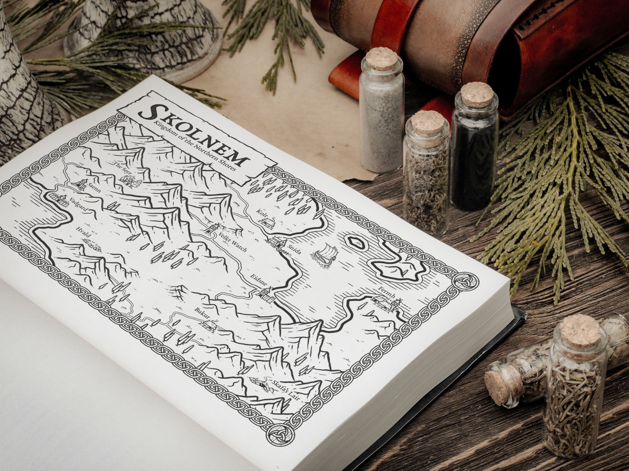
A very real danger of working on a high resolution document is when it's scaled down, certain parts of your map like the titles may no longer be readable. The perfect example of where this can happen is when you create a map for a book. Your map may look awesome when printed on a 16”x23” piece of paper...but once it is scaled down to fit inside a paperback, everything can become muddy and unreadable. This is why it is extremely important to do test prints as you work and save yourself from having to do major revisions down the line.
If you know that your map is going in a book and will only be 8”x 4.5” on a page, then make sure you do a test print on your home printer in those dimensions. Or if your final map will be printed on some larger like a 20”x30” sheet, you can just print sections of the map at full scale to see how it looks. Every printer is a little different, but this will go a long way in taking a lot of the guess work out so you aren’t disappointed when you get your final print.
What if it Prints Too Dark?
Another common problem is a map may look bright and clear on your tablet or computer, but once you print on a regular piece of paper it often looks much darker. The reason for this is your screen is by default set brighter than it should be so that everything looks light and vibrant. Unfortunately this causes problems if you are trying to create art for print. A map will look much different on a bright, back lit screen than it will as ink printed on top of a sheet of paper.
One thing you can do to overcome this problem is to turn the overall brightness of your screen way down, probably by half. It will feel weird at first but trust me, your eyes will adjust. But if your map is already done and you’re ready to print, then it will just be a matter of playing with some adjustment settings in Photoshop, Procreate, or whatever app you may be using. Usually, for me it is a matter of increasing the brightness, lowering the contrast, and lowering the saturation. Your experience may very and you will likely have to do several prints before you are happy with the result.
PIN TO SAVE FOR LATER

What About Resolution or DPI?
Resolution or dpi (dots per inch) is one of those things that is important, but feels complicated when you try to get a simple answer. Essentially, dpi is a somewhat archaic term used for printing as it determined the number of dots a printer would make within a square inch. Obviously, the more dots meant the more detail.
The industry standard for printing is 300 dpi, which should generally be the target when creating a map. But, if your tablet can’t handle a large document at 300 dpi, you generally can get away with 200 dpi and still get a satisfactory print.
A Good Target
A good target document size is usually somewhere around A2 at 300dpi, and then you can modify the actual proportions based on the project. Anything larger than that if you’re working on an Ipad and you may have to break it up into several documents and stitch them together later on a computer. But, most maps won't need to be any larger than this so it's a good size to keep in mind.