
How to Draw a Castle Icon
Drawing castles on your map is a great way to add a sense of history and culture to the world you’ve created. Not only can they represent a seat of power in a region, but they are also a hub for trade and politics. Best of all they are pretty easy to draw with some simple shapes that can be shifted around to provide endless variety and give different cultures a unique look.
All of the brushes I will be using for this tutorial are available in The Map Maker Essential Brushes pack for Procreate & Photoshop.

1: Sketch a Reference
Begin by sketching a rectangle to get an idea of the size you want to make your icon. Be sure to sketch lightly with pencil or on its own layer if working digitally to make it easier to remove later.

2: Draw the Towers
Now that you know how large the icon will be, you can start drawing the towers that will make up the city wall. Don’t get hung up on making them perfect, as little variations will give some more hand-drawn personality.
Rather than just drawing rectangles though, lets give it more personality. Make the sides of each tower taper out slightly as it goes to the base. Then add a curved line at the base of each tower.

3: Connect with the Wall
Draw another rectangle that looks like it is “behind” the towers to finish closing in the city. By drawing the base line of the wall slightly higher than the towers, this helps give the impression of depth.
More Tutorials You May Enjoy


4: Draw Tower Rooftops
Now lets add some coverings so our guards don’t have to stand out in the rain. You don’t want disgruntled soldiers defending your city walls after all!
Notice that the roofs have a slight inward curve to carry on the motif of this style.

5: Finish the Details
Lets put the finishing touches on the castle now with some windows, flags, and small hatching lines to give the walls a bit of texture.
It is important to remember at this point that the icons will likely be quite small when they appear on your map. It’s very easy to go overboard on detail when its actually better to do keep it simple and bold.
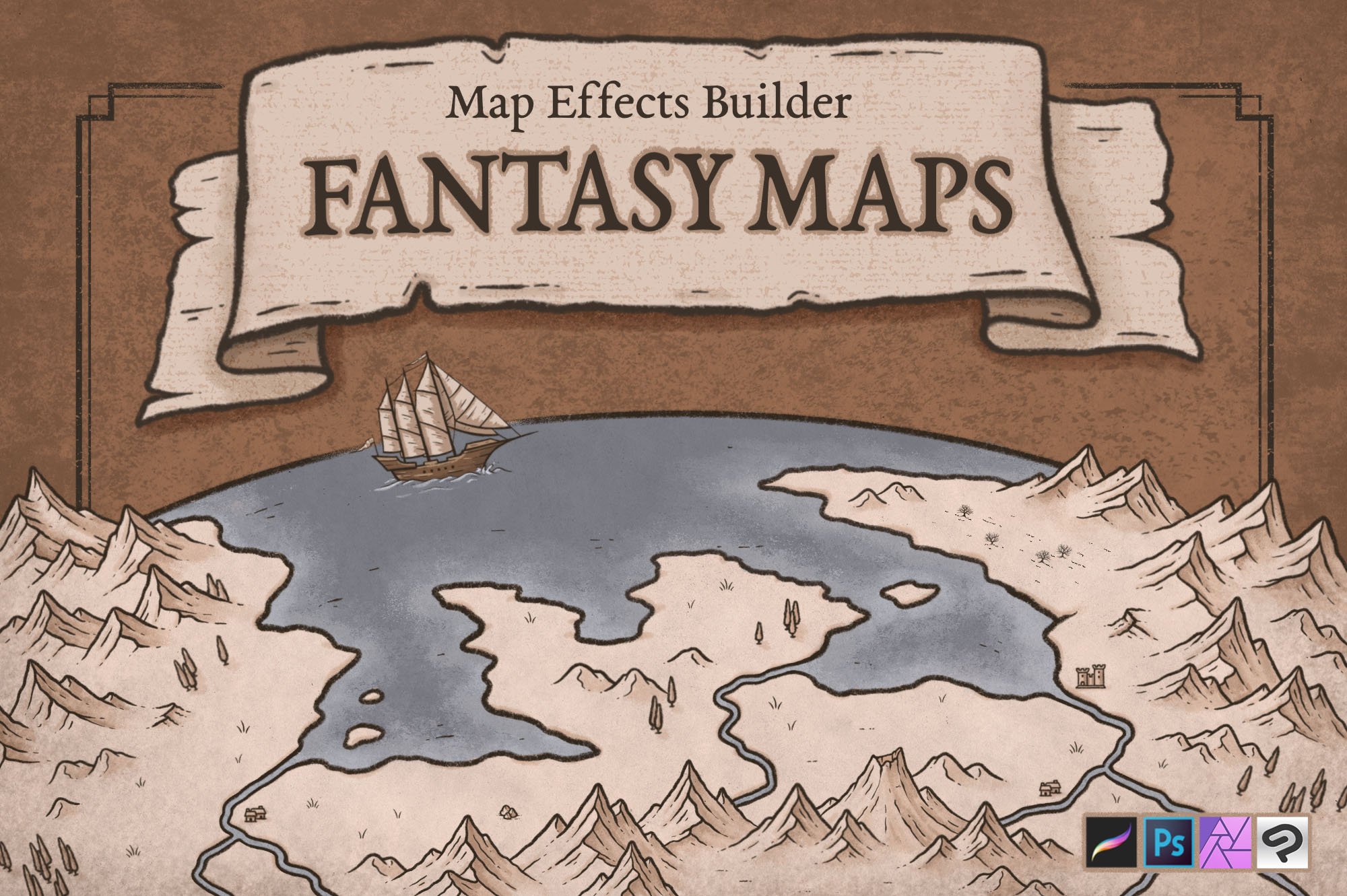
The Fantasy Map Builder
$34 | Now Compatible with Procreate, Photoshop, Affinity, & Clip Studio Paint
Easily create hand-drawn fantasy maps for your upcoming fantasy novel or next role playing campaign without learning how to draw! Whether you want a map for the fantasy book you’re writing or want to make your role playing campaign more immersive, this has you covered. Includes 300+ hand-drawn features to help you map your story!

6: Block in Colors
If you are working digitally, create a new layer below the line art for your coloring. Then paint in some colors that match the overall palette and aesthetic of your map.
Being a bit more nuanced with color can go a long way in making your maps look more professional. Rather than just using a stark, pure gray…mix in a little of the orange hue from the background. Put the most amount of saturation where you want to put the attention. In this case I wanted the eye of the viewer to be more drawn to the rich brown of the rooftops.

7: Paint in the Shadows
Begin by determining a light direction so you know where to place the shadows. Then you can use that as a guide as you imagine what areas of the castle would be obscured from the light.
I know I keep bringing this up, but for this tutorial the icon is several times larger than it would appear on almost any map. Keeping the shading very simple is best, so don’t overthink it.
In this example I used a teal on a new layer with the blend mode set to Multiply and an opacity of 30%. A nice feature of working digitally is being able to lay in color, and then adjusting the opacity slider of the entire layer until you get something you like.

8: Add the Highlights
You can now paint in the highlights to areas of the tower that would be hit by your light source. Even just a thin line of highlight along the top of the walls can really help everything stand out.
For the highlights I used a warmer color painted on a new layer with the blend mode set to Screen and an opacity of 70%.
But Where Should You Place Cities?
Now that your done, the question is where should you place them on your map? There are a few things I like to keep in mind and they are availability of water, food, trade, and is it a strategic location. To learn more check out this guide on Where to Place Cities On Your Fantasy Maps.
Happy Mapping!
Josh
