THE PROJECT
I was approached by Colin Conover to illustrate the map for his upcoming fantasy novel, The Mages of Eden. The story is set in a medieval world that is torn apart by war with a narrative that doesn’t shy away from those realities.
Colin wanted something that reflected a classic medieval fantasy style, while keeping surrounding elements simple in order to keep the focus on the map itself. To ensure the map would read clearly in a book, the map was to be done using only line work.
THE PROCESS
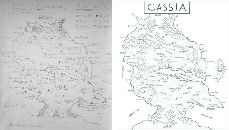
The first step in the process was to take the sketch that Colin had created and draw a rough sketch of my own to ensure my interpretation accurately reflected the world. I also wanted to focus on composition and make sure that none of the important locations fell in the gutter of the book where they would be cut off when printed.
We worked together on the orientation of the map and decided it was best to display it horizontally with the gutter of the book dividing the upper and lower regions of Cassia. With the amount of locations and detail in the map it needed to work well across two pages rather than trying to fit it onto one.
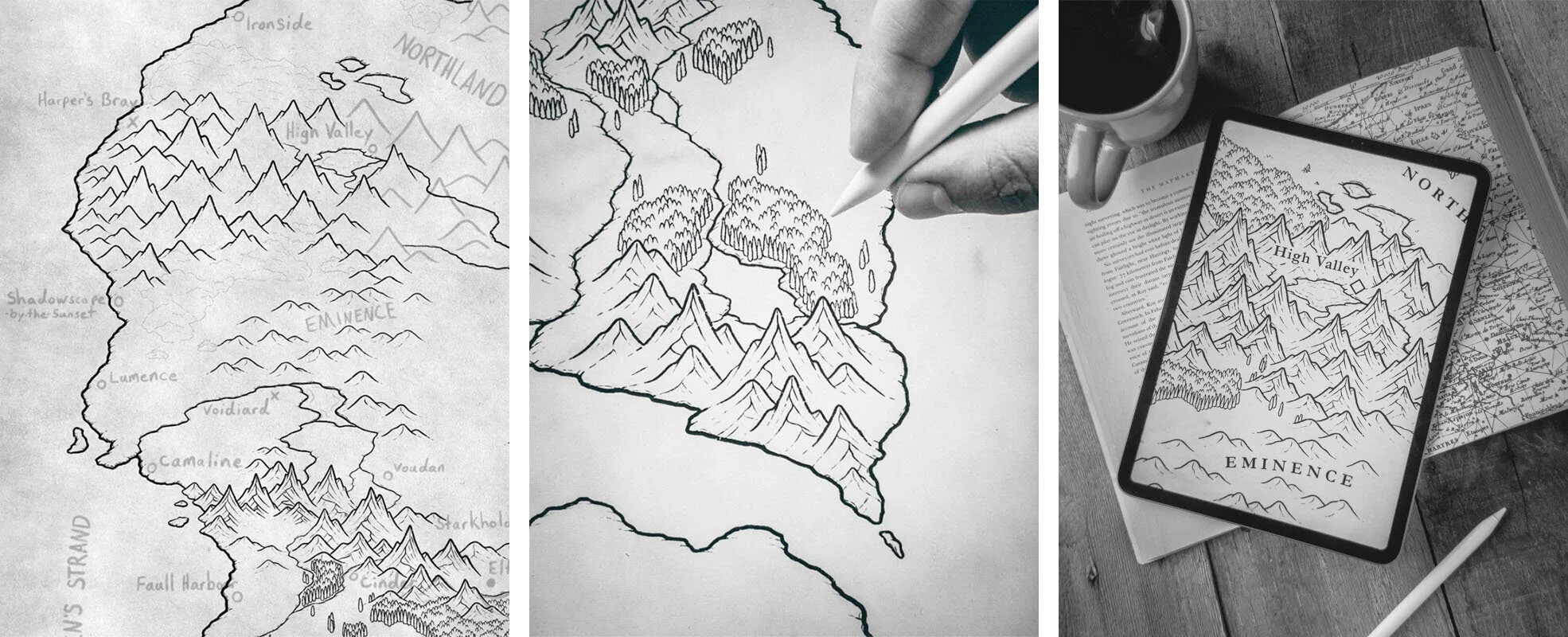
With the sketch complete I began drawing the final line work, using my sketch as a guide. The first thing I like to draw is the coastlines and the mountains; then I use those as my foundation for adding forests, terrain details, and finally locations.
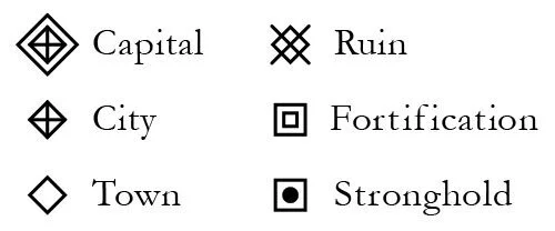
One of the challenges for this map was creating icons that were unique from one another, while also being recognizable at a very small scale. In the original brief with Colin he expressed that he wanted icons for each location that were simple and clear. Which worked perfectly with the map as anything more complex would be lost. I decided to use a diamond as the base for the habitations, and a square for the fortified locations. This meant all the icons would look like they fit together, while providing flexibility to make each one unique.
THE FINISHED MAP
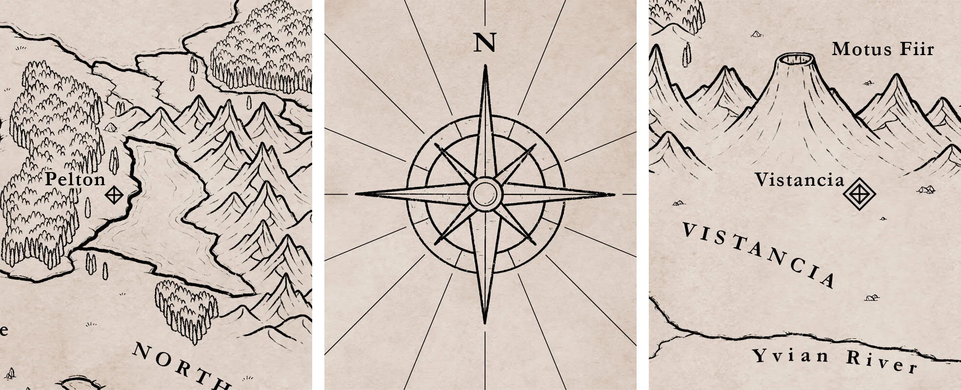
One of the things that I really enjoyed about this project was the limitation of having to depend solely on line art for the finished piece. It was a balance of how much detail to include, while keeping it simple enough to read clearly when printed in a book. I was very happy with the final map.
“It was always a dream. This made it real.”
- Colin Conover


